

This gem was last updated on the 19.04.2024 (dd.mm.yyyy notation), at 17:25:40 o'clock.
Introduction to the swing_paradise project and its different goals
In the last some months of the year 2023/2024 I thought about the goals of this project. This made me re-arrange the introductionary section here. I will keep a numbered list of the goals of the swing_paradise project.
(1) This gem contains some add-on bindings to jruby-Swing. This is the primary goal.
Swing is an extension of the Abstract Window Toolkit (AWT), a GUI (graphical user interface).
As Swing depends on Java, this project here really only makes sense for use via jruby.
At present the project is fairly incomplete, but over the coming months this should be improved. Right now this project is beta-quality and I do not recommend anyone to use this project. However had, for some limited scope, this project may be fairly useful even if incomplete.
(2) Note that while the primary focus of this project will be on Swing-based applications and add-on improvements, to make working with jruby and Swing suck less, there is a secondary focus for this project as well, in that I will attempt to create as many Swing-based applications as possible, to make working on Windows suck less. Most of these add-ons will reside under swing_paradise/widget_collection/, but some may be grouped into different gems, under either gui/jruby/ or gui/universal_widgets. The latter will probably become more relevant in the future, whereas for now, gui/jruby/ will be where most of the gui-relevant bindings reside under.
With "Swing-based applications" I specifically mean being able to use custom, ad-hoc widgets that solve certain problems, such as "I want to delete the first page of this .pdf file, via a GUI", on windows. In fact, that has been one major use case why I intensified code for this project in October 2023 - I had to use windows as primary operating system every now and then, and it always annoyed me compared to Linux, so I decided to create widgets (and describe them, too) that will help me on windows. Also note that this is an ongoing effort - I can not predict how useful and extensive this will be. Stay tuned nonetheless.
(3) Another focus of this project is to provide useful documentation in regards to Swing, as well as jruby. This helps me as a mnemonic, but it may also be helpful to new users, in what they can do with the project here in the long run. When I started this project there was next to no project that documented Swing + jruby. So one aim of this project has been to polish the documentation as much as possible.
Terminology
In Java-Swing, a window is called a frame, which is represented by class JFrame.
The default layout for Java-Swing components is a border layout.
SwingParadise::BaseModule
SwingParadise::BaseModule is the core helper module of this gem.
You can include it, since it is a module, via:
require 'swing_paradise/base_module/base_module.rb'
include SwingParadise::BaseModule
See also the distributed examples if you want to know more about how to use this in practice.
Since as of 29th October 2023, this will also automatically pull in most of the important java-swing methods. I found this easier to work with, than have to remember which widgets I need.
This is done via java_import statements, such as:
java_import javax.swing.JPasswordField
So basically you can omit a few lines in your application by tapping into the BaseModule module.
Simplified quitting
Use the following method to quit easily:
do_quit
For instance, a quit button could then be done in this manner:
.on_clicked {
do_quit
}
Useful java_import headers
include Java

java_import javax.swing.JButton
java_import javax.swing.JFrame
java_import javax.swing.JLabel
java_import javax.swing.JPanel
java_import javax.swing.JTextArea
java_import javax.swing.JScrollBar
java_import javax.swing.JTextField
java_import javax.swing.JSpinner
java_import javax.swing.SpinnerNumberModel
java_import java.lang.System
java_import java.awt.Font
Usage example for setBounds
_.setBounds(10, 20, 200, 40)  /* is: x-coordinate, y-coordinate, width, height) */
_.set_bounds(10, 20, 200, 40) /* is: x-coordinate, y-coordinate, width, height) */
Note that both variants work. I prefer .set_bounds().
JTextArea
First, let's have a look as to how a JTextArea may look like (on Windows):

The JTextArea class provides a component that displays multiple lines of text.
If only one line of input is required from the user, then a text field should be used rather than JTextArea.
In raw Java, the code for instantiating a new JTextArea goes like this:
text_area = new JTextArea(5, 20);
JScrollPane scroll_pane = new JScrollPane(text_area);
text_area.setEditable(false);
In the code above, the API for JTextArea() follows this signature: JTextArea(int rows, int columns) - so you first pass in the number of rows, and then pass in the number of columns.
In Java, you can set the background colour to a colour of your choosing via:
import java.awt.Color;
Color color = new Color(255,0,0); /* This is red. */
text_area.setBackground(color);
The textarea is quite flexible. For instance, you can force it to ignore newlines entered by the user, thus making it essentially a single-line input entry:
textview = create_textarea
textview.getDocument.putProperty('filterNewlines', true)
As this is a bit annoying to remember, I added this method:
textview.filter_newlines
As always, you need to include SwingParadise::BaseModule for this add-on functionality.
Most of the time you probably don't want this behaviour though.
To set to a different background colour, use something like this:
textview.setBackground(Color::GREEN)
Line-wrapping and wrap-style can also be set:
textview.setLineWrap(true)
textview.setWrapStyleWord(false)
JComboBox - working with combo-boxes in Java swing and jruby
You can instantiate a new combo box via:
combo_box = JComboBox.new
Now, in order to fill it up, you can use something like this:
array = %w( apple bird cat dog eagle ferret )
array.each {|this_item|
  combo_box.addItem(this_item)
}
So .addItem() can be used to add more elements to the combo-box.
As the above is a bit cumbersome, if you make use of SwingParadise::BaseModule, you can use the following API instead:
array = %w( apple bird cat dog eagle ferret )
combo_box(array) # So you can simply pass in the full Array here
To select a specific index, that is, a specific entry on that combo box, you can use the method .setSelectedIndex():
combo_box.setSelectedIndex(2) # For the third entry.
To query which index is the currently selected one on a combo-box, use the method .selected_index, as in:
combo_box.selected_index
To obtain the selected entry, use .selected_item, as in:
combo_box.selected_item
Java::JavaAwtEvent::ActionEvent
Events in java can be found under java.awt.events.*.
class Java::JavaAwtEvent::ActionEvent is the base class for when Java Swing fires an event, such as when the user changes the content of a combo-box.
The syntax to use it, from jruby, goes like this:
.add_action_listener { |event|
}
So you designate a block variable; I recommend to consistently call it event, as that should simplify things.
How can you find out the specific event?
One way goes via the method .get_action_command(), such as in:
event.get_action_command

action_command = event.get_action_command
For the changed content of a combo-box, the result would comboBoxChanged.
To respond to this, you can use the following snippet:
case event.get_action_command
when /comboBoxChanged/
end
I needed this functionality for a widget that, when the user changes the combo-box content, another entry is also changed, reflecting the currently selected entry there.
Available colours
Just a simple listing of available colours in a java swing application:
Color::RED
Color::BLUE
Color::GREEN
Color::BLACK
Obtaining the height and width of a widget
Use .getBounds as in:
frame.getBounds()
height = r.height
width  = r.width
The GridLayout
A GridLayout in java-swing looks like this:
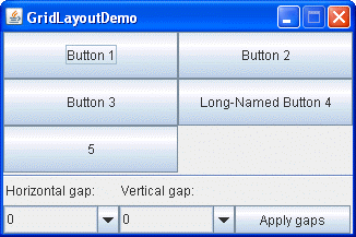
In other words: you arrange elements (widgets) in a 2D-like matrix. This is also called a grid of cells. Each component in the grid is exactly the same size.
To create a new GridLayout, in raw Java, use this:
/* API: GridLayout(int rows, int cols) */
GridLayout x = new GridLayout(3, 3); /* A 3x3 grid */
You can then add new elements to it via:
.add(new JButton("Button 1"));
.add(new JButton("Button 2"));
And so forth.
If you use SwingParadise::BaseModule then you can also make use of the .create_grid() method.
grid = create_grid('2x2')
grid.add(('Button 1'))
grid.add(('Button 2'))
This should be equivalent to the above mentioned Java code.
JCheckBox and checkboxes in Java swing
Let's first look at an image how checkboxes look in Java swing:

Let's next have a look at how we add checkboxes in raw Java swing:
JPanel panel = new JPanel();
panel.add(label);

JCheckBox one = new JCheckBox("one");
JCheckBox two = new JCheckBox("two");

panel.add(one);
panel.add(two);
So, we make use of JCheckBox. A second argument can be passed, to determine whether the check-box is checked or whether it is not:
JCheckBox.new("Foobar", true)
JCheckBox.new("Foobar", false)
To determine whether a JCheckBox is checked - aka selected, the following method can be used:
checkbox.isSelected()
Or, if you use the swing_paradise gem, you can also use:
checkbox.is_selected?
To mark the checkbox as checked, use:
checkbox.setSelected(true)
JFrame
To create a new frame, aka a new JFrame, from jruby, use:
frame = JFrame.new # This would be an untitled frame.
frame = JFrame.new("Frame Title") # And this would set the title to "Frame Title".
If you'd like to you could also use the full qualifier (full name), which is:
frame = javax.swing.JFrame.new
# panel = Java::javax::swing::JFrame.new # This variant may also work, but is not as elegant as the one above.
However had, note that both variants shown above are more verbose, so it may not be worth the extra time to type; nonetheless, should you ever have a use case to scope specifically to a particular class, you can preface it via javax.swing (or wherever else that particular swing-class resides at).
To set a grid layout you can use the method called .set_layout(), as seen in the following example:
frame.set_layout(
  java.awt.GridLayout.new(2, 2, 2, 2)
)
This is especially useful for any 2D layouts.
To exit a JFrame, as the main pane, Java Swing usually requires that you use something like this:
frame.setDefaultCloseOperation(JFrame::EXIT_ON_CLOSE)
I found this a bit cumbersome to type and difficult to remember, so the SwingParadise::BaseModule allows you to use this method instead:
default_close
This one is easier for me to remember, and less to type, too.
Note that you can not add a JFrame to another JFrame. I ran into this issue in December 2023, so I had to note this down here.
The explanation I found stated this:
"JFrame is a top level container and as such it cannot be added to any other container."
Typically a JFrame contains two parts: a space area on top for the menu bar, and the content pane below the menu bar. Often the menu bar is missing, though, so the content pane is ultimately more important than the menu bar.
Further methods for the JFrame include these (as a sample):
.setVisible(boolean b)
.setTitle(String title)
.setSize(int width, int height)
.setLocation(int horizontal, int vertical)
.pack()
.setDefaultCloseOperation(int operation)
By default a JFrame is not visible, so we have to use:
frame.setVisible(true)
To make it visible. Conversely you can pass false into this method to hide the JFrame.
You can designate the size of the main JFrame via .setSize():
.setSize(int width, int height)
.setSize(600, 420) # To designate the size of the jframe widget.
Note that calling the method .pack() will resize the frame so that it tightly fits around components embedded into its content pane.
For sake of completion, here is the java code for setting the size of the frame-widget to width 800 and height 800:
frame.setSize(800, 800);
To make the whole application quit when the close-action is triggered, use:
frame.setDefaultCloseOperation(JFrame::EXIT_ON_CLOSE)
JPanel
In raw jruby, you can create a new instance of JPanel by issuing this:
panel = JPanel.new
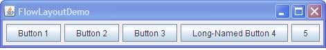
You can then assign different layouts to be used. For instance, to keep the panel left-aligned, meaning you will see new elements all appear in a linear left-to-right fashion, you can use a FlowLayout like this:
panel.layout = FlowLayout.new(FlowLayout::LEFT)
This would look similar to the following image:

This seems quite convenient and easy to use, so the swing_paradise gem tries to make this even easier. Here is the proposed API for the above two lines:
panel = create_panel { :left }
This is exactly the same as:
panel = JPanel.new
panel.layout = FlowLayout.new(FlowLayout::LEFT)
Note that FlowLayout is the default layout manager for every JPanel. The components will be laid out in a single row one after the other.
Here is another picture how this would look:
JPanel can also be used to draw onto, via the method called paintComponent. Whenever the GUI is resized, this method will be automatically called.
Take note that .paintComponent() should not be called directly; instead, use the .repaint() method in the event you wish to draw onto the panel.
The API for paintComponent in raw Java Swing goes as follows:
public void paintComponent(Graphics g)
Graphics here belongs to AWT.
Working with colours in SWING and jruby
The generic way to handle colours in java-swing goes like this:
import java.awt.Color;
Color color = new Color(255,0,0); /* This is red. */
Using no specific layout
Via:
frame.setLayout(nil)
You can avoid using any specific layout.
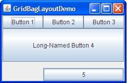
GridBagLayout
GridBagLayout aligns components by placing them within a grid of cells, allowing components to span more than one cell.
The following image shows how this may look like:
JButton and buttons in swing
Java-Swing calls a button JButton. JButton is not the only button available in Java-Swing: we can also use JCheckBox, JRadioButton, JMenuItem, JCheckBoxMenuItem, JRadioButtonMenuItem or JToggleButton.
An example for a widget that uses three buttons will be shown next (on Windows XP):

You can add an icon to a button in swing.
First, let's show the Java version for this:
JButton button = new JButton(new ImageIcon("foobar.jpg"));
ImageIcon can be used for pixel graphics.
Next, the equivalent ruby code:
= JButton.new(ImageIcon.new('foobar.jpg'))
If you use the swing_paradise gem, the above can be simplified a little bit further:
= (ImageIcon.new('foobar.jpg'))
I may extend this API to simplify this further, such as button_with_image() or something like that. In fact, in February 2024 this was indeed extended: if you use SwingParadise::BaseModule then you can use the method called button_with_image() to add a button with an image. There are two ways to call this: one is by simply passing the path to a local image. The second way is to also pass an optional text that is displayed next to the image.
To change the background colour for a button, use the following API:
.setBackground(Color.green) # This would make it green.
To let a JButton respond to on-click events, one has to attach a listener, via the following API:
.addActionListener(ActionListener listener)
In jruby this is implemented via a block form, that is via:
{
}
To focus on a button, use:
.requestFocusInWindow();
To obtain the text (label) if a JButton, use the method .getText.
If you make use of the swing-paradise gem then you can simply call the .on_clicked {} method on a button, such as via:
= JButton.new('Please click me.')
.on_clicked {
puts 'I was clicked.'
}
There is, interestingly enough, another way possible for achieving the above, in that you specify a distinct class that will be invoked when the button is called.
So, the code for the button at hand would then look like this:
= JButton.new('Please click me.')
.addActionListener(ClickAction.new)
And you also need to define class ClickAction, like this:
class ClickAction

  include ActionListener

  def actionPerformed(event) # you can also use: "def action_performed" instead
    puts 'This time the button was called from within clas ClickAction.'
  end

end
This solution is not quite as convenient as the .on_clicked {} variant, but perhaps there may be times when this is needed, so it is mentioned here in the documentation. Personally I will continue to prefer the .on_clicked {} method variant though - my brain has an easier time remembering that variant.
You can also use tooltips for a button. There is, furthermore, a dedicated class, called JToolTip, available for tooltips.
Examples:
.setToolTipText('Press Alt+H to trigger this button.')
.hint = 'Press Alt+H to trigger this button.'
If you need to obtain the tooltip-text, you can use:
puts .getToolTipText
The location where the tooltip will be shown, can be obtained via:
puts .getToolTipLocation(MouseEvent)
If you want to make the button have a flat-style look, use:
.setBorderPainted(false)
.setFocusPainted(false)
.setContentAreaFilled(false)
The full API documentation for JButton can be found here:
https://docs.oracle.com/javase/8/docs/api/javax/swing/JButton.html
JLabel and text
You can right-align a JLabel widget via:
JLabel(String text, int horizontalAlignment)
JLabel label = new JLabel("Telephone", SwingConstants.RIGHT);
In jruby-swing this would look like this:
label = JLabel.new('Telephone', SwingConstants::RIGHT)
After you created a label, you can call several methods on it.
For instance, to change the foreground colour, use:
label.setForeground(Color c)
For the background colour use:
label.setBackground(Color c)
You can also set the label to be opaque, via:
label.setOpaque(boolean b)
label.setOpaque(true)
label.setOpaque(false)
If true is passed to the latter method then the label will be transparent; if it is false, then the label will be non-transparent.
Interestingly you can also use HTML markup in a JLabel. The following example shows how this can be done:
label = JLabel.new("<html><span>This is your text</span></html>");
JColorChooser (javax.swing.colorchooser)
JColorChooser can be used to pick a certain colours.
Let's have a look at an image, to find out how this may actually look:

In raw Java, we would use the following to create a new JColorChooser instance:
= new JLabel("Some text.", JLabel.CENTER);
.setForeground(Color.yellow);
jcolorchooser = new JColorChooser(.getForeground());
add(jcolorchooser, BorderLayout.PAGE_END);
If you want to create a dialog, for the user to make a choice, you can use the .createDialog() method:
jcolorchooser.createDialog()
jcolorchooser.createDialog # Remember, in ruby you can omit the ().
JOptionPane
JOptionPane can be used to ask the user about confirmation about certain actions, such as Do you really want to delete this file?.
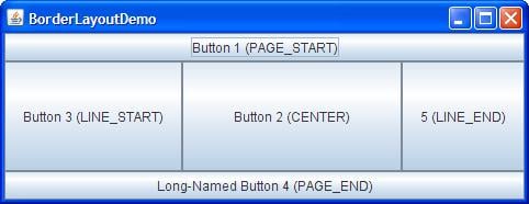
BorderLayout
A BorderLayout places components in up to five areas:
top, bottom, left, right, and center.
It is the default layout manager for every java JFrame.
It looks like this:
BorderFactory
BorderFactory can be used to create a frame with a label.
Usage example in jruby:
_ = BorderFactory.createTitledBorder(' Shell ')
_.setTitleFont(Font.new('Tahoma', Font::PLAIN, 50)) # This here can be used to set the font that is used.
Many variants exist for BorderFactory.
For instance, to set a matte-border, you can use:
ImageIcon icon = createImageIcon("images/wavy.gif", "wavy-line border icon"); # 20x22
BorderFactory.createMatteBorder(-1, -1, -1, -1, icon));
ImageIcon
The name icon is a slight misnomer for this class, as it can also deal with large images.
As argument to this class the path to a local filename should be supplied, as a String.
Example:
image_icon = ImageIcon.new('/tmp/foobar.png')
You can also supply an URL instead of a String to a local path.
You can query the height and width of this image via:
image_icon.getImageHeight() # returns the image height, in n pixels.
image_icon.getImageWidth()  # returns the image width,  in n pixels.
Keep in mind that instances of class ImageIcon are non-graphical components. This means that they have to be put into some container, such as JLabel, e. g.:
JLabel.new(ImageIcon picture)
JLabel.new(image_icon) # re-using the variable defined above ^^^
You can also load images asynchronously. This can be done via Toolkit from the AWT library.
Example in Java-Swing:
Image picture = Toolkit.getDefaultToolkit.getImage(String filename);
Image picture = Toolkit.getDefaultToolkit.getImage(String url);
In jruby-Swing:
picture = Toolkit.getDefaultToolkit.getImage(String filename)
picture = Toolkit.getDefaultToolkit.getImage('foobar.png')
If you need to load multiple images, possibly distributed on various servers on the internet, you may want to make use of class MediaTracker, which is part of the AWT library. MediaTracker can monitor the loading process of many images. Interestingly MediaTracker makes use of an id, such as via the following method call:
.addImage(Image picture, int id)
Java::JavaAwtEvent::ActionEvent and events in general
An event in a SWING application is typically of class Java::JavaAwtEvent::ActionEvent, as far as Ruby is concerned.
JTextField
JTextField is a lightweight component that allows the editing of a single line of text.
A JTextField - also known as an entry - is a subclass of the JTextComponent class.
Padding can be added to a JTextField via the method .setMargin() and passing proper insets to it.
Example:
setMargin(Insets m)

text_field = new JTextField("A text field example.");
text_field.setMargin(new Insets(10, 10, 10, 10));
JTextField can also be instantiated in the following manner:
JTextField(String text, int columns)
So the second argument means how many columns this entry should have.
Documentation for JTextField can be seen here:
https://docs.oracle.com/javase/8/docs/api/javax/swing/JTextField.html
Textfields in Java-SWING via JFormattedTextField
If you have a need to hide certain input elements, such as via a user-password, you could use the following code, in Java-SWING:
import javax.swing.text.MaskFormatter;
MaskFormatter mask_formatter = new MaskFormatter("###-##-####");
JFormattedTextField has three preconfigured format types:
numbers
dates
strings
JScrollBar
First, before this subsection explains some things about a JScollBar, let us state that in many cases a developer may want to use JScrollPane instead.
JScrollBar is used to create a scrolling widget. This refers to a widget that has a vertical and a horizontal bar - both of which can be optional - allowing the mouse pointer to click and drag the child-widget, to the right, left, up or down. This is especially useful for a text-buffer widget, where regular text is displayed that overflows to the right hand side (or somewhere else).
The following image shows how this looked on Windows XP:

So, to summarize: the scroll bar is used to determine the viewing area of the component (the child-widget).
The scroll bar involves a knob that can be adjusted by the user. This is meant for use with the mouse pointer.
How to create a new instance for a scroll bar in Java?
The following code example (ScrollBarExample.java) shows this:
import javax.swing.*;
import java.awt.*;

class ScrollBarExample {

  public static void main(String[] args) {
    final JFrame frame = new JFrame("ScrollBarExample");

    JScrollBar scrollBarH = new JScrollBar(JScrollBar.HORIZONTAL, 30, 20, 0, 500);
    JScrollBar scrollBarV = new JScrollBar(JScrollBar.VERTICAL,   30, 40, 0, 500);

    frame.setSize(300,200);
    frame.getContentPane().add(scrollBarH, BorderLayout.SOUTH);
    frame.getContentPane().add(scrollBarV, BorderLayout.EAST);
    frame.setVisible(true);
  }

}
Which relevant properties does the scroll bar have?
orientation: This indicates a horizontal or a vertical Scrollbar.
value:       This indicates the model's current value. The upper
             limit on the model's value is maximum - extent and the
             lower limit is minimum.
extent:      This indicates the width of the knob of the scrollbar.
minimum:     This indicates the minimum width of the track on which the scrollbar moves.
maximum:     This indicates the maximum width of the track on which the scrollbar moves.
If you instantiate a new scrollbar in jruby, using this syntax:
JScrollBar.new
then the following initial values are used:
minimum =   0
maximum = 100
value   =   0
extent  =  10
The first argument is orientation (as Integer).
Example:
JScrollBar.new(int orientation)
JScrollBar.new(1)
In other words: you can use this to determine the orientation of the scrollbar. The value orientation=0 means we will make use of a horizontal scroll bar, whereas the value orientation=1 means we will get a vertical scroll bar. Most commonly a horizontal scroll bar is used.
The most commonly used methods of the JScrollBar class are as follows:
- The addAdjustmentListener(AdjustmentListener l) method adds a
  listener to the specified JScrollBar instance. The listener
  will be notified every time a change to the model of the
  scroll bar is detected.
- The getModel() method returns the model of the scroll bar.
- The getMaximum() method returns the maximum value (maximum -
  extent) of the scrollbar.
- The getMinimum() method returns the minimum value of the scroll
  bar.
- The getOrientation() method returns the orientation of the
  scroll bar.
- The getValue() method returns the scrollbar’s value.
- The setMaximum() method is used to set the maximum value
  of the scrollbar.
- The setMinimum() method is used to set the minimum value of the scroll bar.
- The setOrientation() method is used to set the orientation of the scroll bar.
- The setValue() method is used to set the scrollbar’s value.
If you want to set inner padding, you have to make use of a border:
.setBorder(BorderFactory.createEmptyBorder(10, 10, 10, 10))
A JScrollBar has several properties by default.
The following listing shows some of these properties:
accessibleContext
adjustmentListeners
blockIncrement
enabled
maximum
maximumSize
minimum
minimumSize
model
orientation
UI
UIClassID
unitIncrement
value
valueIsAdjusting
visibleAmount
Checking for the escape-key being pressed
In raw Java SWING, we can use the following line of code to check whether the user has pressed the escape-key:
if (event.getKeyCode() == KeyEvent.VK_ESCAPE) {
}
In jruby SWING, this would be:
if (event.getKeyCode() == KeyEvent::VK_ESCAPE) {
}
Note that KeyEvent::VK_ESCAPE returns a number; in this case that number is 27.
The Graphics class
Available methods include:
drawLine(int xstart, int ystart, int xend, int yend)
drawRect(int xleft, int ytop, int width, int height)
drawOval(int xleft, int ytop, int width, int height)
drawString(String text, int xleft, int ybottom)
fillRect(int xleft, int ytop, int width, int height)
fillOval(int xleft, int ytop, int width, int height)
setColor(Color col)
All these int-arguments refer to pixels.
.drawLine(xstart,ystart,xend,yend) draws a line segment between the points with coordinates (xstart, ystart) and (xend, yend).
Note that .setColor(col) sets the colour of the drawing to col. This colour is used until the setColor command is used again.
JScrollPane
First, let's have a look how a JScrollPane may look like:

JScrollPane is the primary widget to be used when scrolling should be used (in Swing).
Next, let's look at a raw Java example for how to work with a JScrollPane:
import java.awt.FlowLayout;
import javax.swing.JFrame;
import javax.swing.JScrollPane; /* This is where it resides. */
import javax.swing.JtextArea;

public class JScrollPaneExample {
  private static final long serialVersionUID = 1L;

  private static void createAndShowGUI() {

    // Create and set up the window.
    final JFrame frame = new JFrame("Scroll Pane Example");

    // Display the window.
    frame.setSize(500, 500);
    frame.setVisible(true);
    frame.setDefaultCloseOperation(JFrame.EXIT_ON_CLOSE);

    // set flow layout for the frame
    frame.getContentPane().setLayout(new FlowLayout());

    JTextArea textArea = new JTextArea(20, 20);
    JScrollPane scrollableTextArea = new JScrollPane(textArea);

    scrollableTextArea.setHorizontalScrollBarPolicy(JScrollPane.HORIZONTAL_SCROLLBAR_ALWAYS);
    scrollableTextArea.setVerticalScrollBarPolicy(JScrollPane.VERTICAL_SCROLLBAR_ALWAYS);

    frame.getContentPane().add(scrollableTextArea);
  }
  public static void main(String[] args) {

    javax.swing.SwingUtilities.invokeLater(new Runnable() {
      public void run() {
        createAndShowGUI();
      }
    });
  }
}
In jruby this may look like so:
text_area = JTextArea.new(20, 20)
scrollable_text_area = JScrollPane.new(text_area) # Add the scroll-pane here.
scrollable_text_area.setHorizontalScrollBarPolicy(JScrollPane::HORIZONTAL_SCROLLBAR_ALWAYS)
scrollable_text_area.setVerticalScrollBarPolicy(JScrollPane::VERTICAL_SCROLLBAR_ALWAYS)
In other words: you pass the widget that you want to see scroll-bars for, into JScrollPane.new() - in that case, the variable text_area.
The viewport that you see will display the content of the JTextArea then.
If the whole component fits into the viewport then the default behaviour is that the scroll bars disappear. This behaviour can be changed, though, via the horizontal and vertical policy.
Using mnemonics for JButton
You can use shortcut-keys, aka mnemonics, for buttons.
This is done in general via the method called .setMnemonic().
Example for this:
.setMnemonic(KeyEvent::VK_H)
VK_H means Alt+H. Alt here refers to the Alt-key. H is simply the letter H on the keyboard, so this means "press the alt-key as well as the h key".
If you instead want to enable Akt+H, use:
.setMnemonic(KeyEvent::VK_A)
You can also use numbers instead. For instance:
.setMnemonic(KeyEvent::VK_1)
This would allow you to respond to "Alt+1" key combinations. You can find examples related to this in the file at examples/017_button_example.rb. That file will, in the long run, contain all useful button-related activities that may be useful when designing applications via jruby-SWING.
As I find this a bit cumbersome to remember (I can't remember VK_1 or similar crypt names), I decided to add an API that simplifies this.
Usage example:
.keycombo('Alt+1') # respond to alt+1
.keycombo('Alt+W') # respond to alt+W
Note that this currently (January 2024) only works for Alt-key combinations. At a later time I may extend this for more key-combinations.
Working with JTable
A new table can be created via:
JTable(int rows, int cols): Creates a table of size rows * cols.
Like a table with (2, 3), 2 rows, and 3 columns.
You can also simplify it a bit, by using javax.swing.table.DefaultTableModel via:
m = javax.swing.table.DefaultTableModel.new
m.add_column("id")
m.add_column("name")
m.add_row(['1', "jimmy"].to_java)
m.add_row(['2', "robert"].to_java)

table = JTable.new(m)
# The full qualifier for JTable is javax.swing.JTable, by the way.
You can add java-specific objects, such as a vector, via:
m.add_row java.util.Vector.new('"ト', 'あ', 'い'])
You can also pass the columns by calling DefaultTableModel.new, like this:
m = DefaultTableModel.new(nil, ["No.", "Name", "Path"].to_java)
The API documentation for JTable can be found here:
https://docs.oracle.com/javase/8/docs/api/javax/swing/JTable.html
Converting an Array into Java::JavaLang:Object:
This can be done by calling .to_java.
Example for this:
pp ["1", "jimmy"].to_java # => #<Java::JavaLang::Object[2]: ["1", "jimmy"]>
JComponent
Every JComponent can have one or more borders.
You can put a border around a JComponent. This is done via the .setBorder() method.
This method is usually combined with the BorderFactory class.
In raw Java swing, the code would look like this:
JPanel pane = new JPanel();
pane.setBorder(BorderFactory.createLineBorder(Color.black));
javax.swing.border
This subsection may eventually contain some information about borders in java-swing applications.
JTextPane
JTextPane can be used to render HTML content.
The full scope of JTextPane is javax.swing.JTextPane.
Creating a MenuBar via JMenu
First, let's look at how a Menu (JMenu) looks in Java-Swing:

The primary menu bar is called JMenuBar in Java-Swing.
To then create a menu, in raw Java-Swing, the following code could be used:
JMenuBar menu_bar = new JMenuBar(); # Create a new menubar here.
JMenu m1 = new JMenu("FILE");
menu_bar.add(m1);
JMenu m2 = new JMenu("Help");
menu_bar.add(m2);
Or in jruby code:
= JMenuBar.new
m1 = JMenu.new("FILE")
.add(m1)
m2 = JMenu.new("Help")
.add(m2)
If you use the swing_paradise gem then you can also use << rather than .add(). Example:
<< m1
<< m2
This is a bit shorter to type.
Take note that the constructor for JMenu is this:
JMenu(String );
JMenu.new() # This for jruby.
So the name of the menu entry should be given, as a String.
You can also attach mnemonics to this, such as via:
= JMenu.new('A Menu')
.setMnemonic(KeyEvent.VK_A)
As can be seen from the above code, we first need to create a new JMenuBar - this is the first step.
Then, now that we have a menu-bar, we can add new menus to it, of class JMenu. We use the method called .add() to add menu-entries there.
Once you are done with the menu, it is time to add it. The menu is typically added to a JFrame, via the following API:
setJMenuBar(JMenuBar )
frame.setJMenuBar()
Take note that there are two distinct methods that are rather similar: one is called .setJMenuBar and the other one is called .setMenuBar. JMenuBar() is for Swing and MenuBar() is for AWT.
Individual Menu items behave like buttons.
If you have a need to disable an individual menu item then you can do so via:
setEnabled(boolean b)
Example in jruby-Swing for disabling a menu item:
.setEnabled(false)
To then bind an event to a menu-item, use .addActionListener.
Example for this:
first = JMenuItem.new('Item 1')
m1.add(first)
first.addActionListener {|event|
  puts 'Hello world!'
}
# Or, to exit, use this:
first.add_action_listener { |event|
  System.exit(0) # or just exit, should be fine too.
}
If you have a need to repaint the menu bar, you can use .revalidate() as in:
.revalidate()
.revalidate # or this one, as ruby allows you to omit ()
Once you created your menu, you have to fill the submenus with JMenuItem entries. The following shows such an example I was using in January 2024:
open_a_local_file_entrypoint = JMenuItem.new('Open a local file', KeyEvent::VK_T)
open_a_local_file_entrypoint.use_this_font = :hack_26
open_a_local_file_entrypoint.addActionListener {|event|
  do_choose_a_local_file_then_read_it_in
}
m1.add(open_a_local_file_entrypoint)
So, to respond to the on-selected event, make use of .addActionListenere.
JSplitPane() and working with JSplitPane
Via JSplitPane - to be found under javax.swing.JSplitPane - you can split a pane, such as splitting into a left and a right component.
Let's look at two images as to how JSplitPane looks like:


To create a new split-pane, you would use the following code:
split_pane = JSplitPane.new(JSplitPane::VERTICAL_SPLIT)
You can then modify its layout, or whether it allows one-touch expendable behaviour:
split_pane.setContinuousLayout(true)
split_pane.setOneTouchExpandable(true)
You can then put other widgets into it, such as a button on top:
= JButton.new('A')
split_pane.setTopComponent()
And a button on bottom:
=JButton.new('B')
split_pane.setBottomComponent()
Assigning Enter as the trigger key for all JButtons in a Java-Swing application
UIManager.put("Button.defaultButtonFollowsFocus", Boolean::TRUE)
Font, working with fonts and using fonts in a java-swing application
Working with fonts in a java-swing application (or jruby-swing application) can be a bit tricky. This paragraph here tries to gather useful information pertaining to this.
The raw Java code for creating a new font, goes like this:
Font use_this_font = new Font("SansSerif", Font.PLAIN, 20);
In jruby this would be equivalent to the following code:
use_this_font = Font.new('SansSerif', Font::Plain, 20)
Next follows a list, as example, how to handle different fonts - first in java-swing, then in jruby-swing:
.setFont(new Font("Times New Roman", Font.PLAIN, 12))
.setFont(new Font("Hack", Font.PLAIN, 40))
# now in jruby:
.setFont(Font.new("Times New Roman", Font::PLAIN, 12))
.setFont(Font.new("Hack", Font::PLAIN, 40))
Choosing files via a GUI, through JFileChooser - file-chooser functionality
Let's first have a look how JFileChooser may look on WinXP:

You can use something like the following to get a file-chooser in jruby-swing:
file_chooser = JFileChooser.new
# file_chooser.setFileSelectionMode(JFileChooser::DIRECTORIES_ONLY)

result = file_chooser.showOpenDialog(nil) # or pass true here, to show the open dialog.
case result
when JFileChooser::APPROVE_OPTION
  this_file = file_chooser.getSelectedFile.getAbsoluteFile.to_s
  # this_file = File.absolute_path(this_file)
  main_entry?.set_text(this_file)
end
Adjust accordingly to your use case. Keep in mind that on closing, a file selection dialogue returns an integer value which is one of the following integer constants:
APPROVE_OPTION: indicates that the ‘Open’ or ‘Save’, in case of a
                save dialogue button of the dialogue has been
                clicked.
CANCEL_OPTION:  indicates that the ‘Cancel’ button of the dialogue
                has been clicked.
Note that JFileChooser::APPROVE_OPTION returns 0.
To obtain the file that was selected, the method .getSelectedFile can be used, as shown in the code example above.
Since as of January 2024 you can also use UniversalWidgets.main_file? and UniversalWidgets.set_main_file() to keep track of the chosen file.
JDialog and dialogues in jruby-SWING
First, what is a dialogue?
A dialogue is basically a simple means, via a widget, to obtain information from the user. This can then be of help for user-program interaction.
Dialogues - that is, the widgets - are used when the application needs information from the user in order to proceed with a task or some other event.
In jruby-SWING, the primary use of dialogues happens via JDialog:
JDialog can be thought of to be a pop-up window that pops out when a message has to be displayed to the user.
The namespace for JDialog is javax.swing.JDialog.
Some dialoguses are pre-defined. For instance, a message dialogue can be invoked via:
JOptionPane.showMessageDialog(
  Component parent,
  String title,
  String message,
  int type
);
More documentation pertaining to JDialog, in particular its API, can be seen here:
https://docs.oracle.com/javase/8/docs/api/javax/swing/JDialog.html
Working with JRadioButton
First, let's look at two images to see how a JRadioButton may look like:


JRadioButton's fully qualified namespace is javax.swing.JRadioButton. Its superclass is a JToggleButton.
To create a new JRadioButton via java-swing, use:
JRadioButton x = new JRadioButton("Foobar");
Radio buttons can be pressed and they can be grouped. They will stay pressed until another radio button of the group is pressed. A black dot appears inside the circular area if the button is pressed, as can be seen on the above image.
The text that is displayed on a radio-button can be defined via passing a String as the first argument, as seen in the above example. For sake of completion we will show how this is done in jruby too:
= JRadioButton.new('Foobar')
If you have a need to programmatically set that radio button selected or de-selected, use this method:
.setSelected(true) # It is now selected.
.setSelected(false) # It is now de-selected.
.setActionCommand(String command) assigns the string command as the action command to the button. Radio buttons are not automatically assigned an action command. This is because their label is often not a text but a picture. The action command can be set via this method.
.getActionCommand() returns the action command assigned to the button.
Normally radio buttons are put into a ButtonGroup. This has the effect that if the user selects one radio button, all other radio buttons are de-selected. In other words: this achieves that only one radio button is actively selected at any given moment in time.
In order to group radio-buttons into a button group, we should first create a new instance of ButtonGroup, such as via:
= ButtonGroup.new
Next, use the method .add() to add radio_buttons into that button group:
.add()
.add()
The API documentation for JRadioButton can be seen here:
https://docs.oracle.com/javase/8/docs/api/javax/swing/JRadioButton.html
Java Swing Plaf
The javax.swing.plaf package contains several subpackages and related packages.
Plaf stands for pluggable look and feel.
Swing versus AWT
Swing component class names begin with a J. AWT components do not.
For instance, JButton is a swing-component whereas Button is an AWT component.
This distinction holds true for most components, but one exception is the JComboBox, which replaces the AWT Choice component.
The following table shows the AWT component and the nearest swing replacement:
AWT Component | Nearest Swing Replacement
Button | JButton Canvas | JPanel Checkbox | JCheckBox Checkbox in CheckboxGroup | JRadioButton in ButtonGroup Choice | JComboBox Component | JComponent Container | JPanel Label | JLabel List | JList Menu | JMenu MenuBar | JMenuBar MenuItem | JMenuItem Panel | JPanel PopupMenu | JPopupMenu Scrollbar | JScrollBar ScrollPane | JScrollPane TextArea | JTextArea TextField | JTextField Applet | JApplet Dialog | JDialog FileDialog | JFileChooser Frame | JFrame Window | JWindow
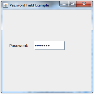
JPasswordField
JPasswordField is a specialized text field that can be used for inputting a password into a Swing-Application.
Cut and copy operations are not possible within this component, but text can be pasted into it.
On Windows it may look like this:
JEditorPane()
JEditorPane() can be used to display text via java-swing.
Let's have a look at an image, how this may look:

If you need to obtain the current text stored in a JEditorPane, you can use the method called .getText().
JSpinner()
JSpinner allows the user to select from an ordered set of predefined values.
Arrows are available to allow the user to scroll through the next and previous choices.
The predefined values can be an array of strings, a sequential set of numbers, or a date.
The JSpinner widget may look like this:

JToggleButton()
A JToggleButton is a button that stays depressed when selected.
JSlider()
This component is similar to the Scrollbar component of AWT, or JScrollBar in the Swing component set. Its purpose in Swing is for user input and it offers various clues to help the user choose a specific value.
A JSlider may look like this:

JProgressBar()
The JProgressBar can be used to visually indicate the progress of an activity.
The display can include static text or percentage done.
JFormattedTextField()
This component provides for the input of formatted text. Such formatted text may be numeric values, phone numbers, dates, or social security numbers.
JTable()
A JTable can be used to display a two-dimensional
row and column information.
JTree()
The JTree() component can be used whenever we wish to display hierarchical data.
JToolBar()
The JToolBar() component offers a draggable toolbar to be included within any program window.
The EventQueue
The EventQueue has some public static methods such as:
isDispatchThread()
isEventDispatchThread()
The latter method acts as a proxy to the former.
If you need to invoke a method at a later time, use:
invokeLater(Runnable runnable)
Note that the method invokeAndWait(Runnable) can throw an InterruptedException or an InvocationTargetException.
The mouse and mouse-events
A mouse event in jruby is of class Java::JavaAwtEvent::MouseEvent.
In Java-Swing two interfaces process mouse events:
1) MouseListener
2) MouseMotionListener
Note that key listeners react to key strokes (aka key press events).
To check if the middle mouse button has been pressed, the mouse listener’s .mousePressed() method may be used.
In raw Java-Swing code this may look as follows:
public void mousePressed(MouseEvent mouseEvent) {
  int modifiers = mouseEvent.getModifiers();
  if ((modifiers & InputEvent.BUTTON2_MASK) == InputEvent.BUTTON2_MASK) {
    System.out.println("Middle button pressed.");
  }
}
However had, you can also use SwingUtilities, which would be much easier:
SwingUtilities.isLeftMouseButton(MouseEvent mouseEvent)
SwingUtilities.isMiddleMouseButton(MouseEvent mouseEvent)
SwingUtilities.isRightMouseButton(MouseEvent mouseEvent)
Usage example in java-swing:
if (SwingUtilities.isMiddleMouseButton(mouseEvent)) {
  System.out.println("Middle button released.");
}
Potentially useful links pertaining to Java-Swing
https://web.mit.edu/6.005/www/sp14/psets/ps4/java-6-tutorial/components.html https://www.javatpoint.com/java-swing
Contact information and mandatory 2FA (no longer) coming up in 2022 / 2023
If your creative mind has ideas and specific suggestions to make this gem more useful in general, feel free to drop me an email at any time, via:
shevy@inbox.lt
Before that email I used an email account at Google gmail, but in 2021 I decided to slowly abandon gmail, for various reasons. In order to limit the explanation here, allow me to just briefly state that I do not feel as if I want to promote any Google service anymore when the user becomes the end product (such as via data collection by upstream services, including other proxy-services). My feeling is that this is a hugely flawed business model to begin with, and I no longer wish to support this in any way, even if only indirectly so, such as by using services of companies that try to promote this flawed model.
In regards to responding to emails: please keep in mind that responding may take some time, depending on the amount of work I may have at that moment. So it is not that emails are ignored; it is more that I have not (yet) found the time to read and reply. This means there may be a delay of days, weeks and in some instances also months. There is, unfortunately, not much I can do when I need to prioritise my time investment, but I try to consider all feedback as an opportunity to improve my projects nonetheless.
In 2022 rubygems.org decided to make 2FA mandatory for every gem owner eventually:
see https://blog.rubygems.org/2022/06/13/making-packages-more-secure.html
However had, that has been reverted again, so I decided to shorten this paragraph. Mandatory 2FA may exclude users who do not have a smartphone device or other means to 'identify'. I do not feel it is a fair assumption by others to be made that non-identified people may not contribute code, which is why I reject it. Mandatory 2FA would mean an end to all my projects on rubygems.org, so let's hope it will never happen. (Keep in mind that I refer to mandatory 2FA; I have no qualms for people who use 2FA on their own, but this carrot-and-stick strategy by those who control the rubygems infrastructure is a very bad one to pursue.