Class: Google::Apps::Card::V1::Card
- Inherits:
-
Object
- Object
- Google::Apps::Card::V1::Card
- Extended by:
- Protobuf::MessageExts::ClassMethods
- Includes:
- Protobuf::MessageExts
- Defined in:
- proto_docs/google/apps/card/v1/card.rb
Overview
A card interface displayed in a Google Chat message or Google Workspace add-on.
Cards support a defined layout, interactive UI elements like buttons, and rich media like images. Use cards to present detailed information, gather information from users, and guide users to take a next step.
To learn how to build cards, see the following documentation:
- For Google Chat apps, see Design the components of a card or dialog.
- For Google Workspace add-ons, see Card-based interfaces.
Note: You can add up to 100 widgets per card. Any widgets beyond this limit are ignored. This limit applies to both card messages and dialogs in Google Chat apps, and to cards in Google Workspace add-ons.
Example: Card message for a Google Chat app
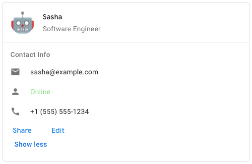
To create the sample card message in Google Chat, use the following JSON:
{
  "cardsV2": [
    {
      "cardId": "unique-card-id",
      "card": {
        "header": {
           "title": "Sasha",
           "subtitle": "Software Engineer",
           "imageUrl":
           "https://developers.google.com/workspace/chat/images/quickstart-app-avatar.png",
           "imageType": "CIRCLE",
           "imageAltText": "Avatar for Sasha"
         },
         "sections": [
           {
             "header": "Contact Info",
             "collapsible": true,
             "uncollapsibleWidgetsCount": 1,
             "widgets": [
               {
                 "decoratedText": {
                   "startIcon": {
                     "knownIcon": "EMAIL"
                   },
                   "text": "sasha@example.com"
                 }
               },
               {
                 "decoratedText": {
                   "startIcon": {
                     "knownIcon": "PERSON"
                   },
                   "text": "<font color=\"#80e27e\">Online</font>"
                 }
               },
               {
                 "decoratedText": {
                   "startIcon": {
                     "knownIcon": "PHONE"
                   },
                   "text": "+1 (555) 555-1234"
                 }
               },
               {
                 "buttonList": {
                   "buttons": [
                     {
                       "text": "Share",
                       "onClick": {
                        "openLink": {
                           "url": "https://example.com/share"
                         }
                       }
                     },
                     {
                       "text": "Edit",
                       "onClick": {
                         "action": {
                           "function": "goToView",
                           "parameters": [
                             {
                               "key": "viewType",
                               "value": "EDIT"
                             }
                           ]
                         }
                       }
                     }
                   ]
                 }
               }
             ]
           }
         ]
       }
    }
  ]
}
Defined Under Namespace
Modules: DisplayStyle, DividerStyle Classes: CardAction, CardFixedFooter, CardHeader, NestedWidget, Section
Instance Attribute Summary collapse
-
#card_actions ⇒ ::Array<::Google::Apps::Card::V1::Card::CardAction>
The card's actions.
-
#display_style ⇒ ::Google::Apps::Card::V1::Card::DisplayStyle
In Google Workspace add-ons, sets the display properties of the
peekCardHeader. -
#fixed_footer ⇒ ::Google::Apps::Card::V1::Card::CardFixedFooter
The fixed footer shown at the bottom of this card.
-
#header ⇒ ::Google::Apps::Card::V1::Card::CardHeader
The header of the card.
-
#name ⇒ ::String
Name of the card.
-
#peek_card_header ⇒ ::Google::Apps::Card::V1::Card::CardHeader
When displaying contextual content, the peek card header acts as a placeholder so that the user can navigate forward between the homepage cards and the contextual cards.
-
#section_divider_style ⇒ ::Google::Apps::Card::V1::Card::DividerStyle
The divider style between the header, sections and footer.
-
#sections ⇒ ::Array<::Google::Apps::Card::V1::Card::Section>
Contains a collection of widgets.
Instance Attribute Details
#card_actions ⇒ ::Array<::Google::Apps::Card::V1::Card::CardAction>
Returns The card's actions. Actions are added to the card's toolbar menu.
For example, the following JSON constructs a card action menu with
Settings and Send Feedback options:
"card_actions": [
  {
    "actionLabel": "Settings",
    "onClick": {
      "action": {
        "functionName": "goToView",
        "parameters": [
          {
            "key": "viewType",
            "value": "SETTING"
         }
        ],
        "loadIndicator": "LoadIndicator.SPINNER"
      }
    }
  },
  {
    "actionLabel": "Send Feedback",
    "onClick": {
      "openLink": {
        "url": "https://example.com/feedback"
      }
    }
  }
]
```.
216 217 218 219 220 221 222 223 224 225 226 227 228 229 230 231 232 233 234 235 236 237 238 239 240 241 242 243 244 245 246 247 248 249 250 251 252 253 254 255 256 257 258 259 260 261 262 263 264 265 266 267 268 269 270 271 272 273 274 275 276 277 278 279 280 281 282 283 284 285 286 287 288 289 290 291 292 293 294 295 296 297 298 299 300 301 302 303 304 305 306 307 308 309 310 311 312 313 314 315 316 317 318 319 320 321 322 323 324 325 326 327 328 329 330 331 332 333 334 335 336 337 338 339 340 341 342 343 344 345 346 347 348 349 350 351 352 353 354 355 356 357 358 359 360 361 362 363 364 365 366 367 368 369 370 371 372 373 374 375 376 377 378 379 380 381 382 383 384 385 386 387 388 389 390 391 392 393 394 395 396 397 398 399 400 401 402 403 404 405 406 |
# File 'proto_docs/google/apps/card/v1/card.rb', line 216 class Card include ::Google::Protobuf::MessageExts extend ::Google::Protobuf::MessageExts::ClassMethods # Represents a card header. For an example in Google Chat apps, see [Add a # header](https://developers.google.com/workspace/chat/design-components-card-dialog#add_a_header). # # [Google Workspace add-ons and Chat # apps](https://developers.google.com/workspace/extend): # @!attribute [rw] title # @return [::String] # Required. The title of the card header. # The header has a fixed height: if both a # title and subtitle are specified, each takes up one line. If only the # title is specified, it takes up both lines. # @!attribute [rw] subtitle # @return [::String] # The subtitle of the card header. If specified, appears on its own line # below the `title`. # @!attribute [rw] image_type # @return [::Google::Apps::Card::V1::Widget::ImageType] # The shape used to crop the image. # # [Google Workspace add-ons and Chat # apps](https://developers.google.com/workspace/extend): # @!attribute [rw] image_url # @return [::String] # The HTTPS URL of the image in the card header. # @!attribute [rw] image_alt_text # @return [::String] # The alternative text of this image that's used for accessibility. class CardHeader include ::Google::Protobuf::MessageExts extend ::Google::Protobuf::MessageExts::ClassMethods end # A section contains a collection of widgets that are rendered # vertically in the order that they're specified. # # [Google Workspace add-ons and Chat # apps](https://developers.google.com/workspace/extend): # @!attribute [rw] header # @return [::String] # Text that appears at the top of a section. # Supports simple HTML formatted text. For more information # about formatting text, see # [Formatting text in Google Chat # apps](https://developers.google.com/workspace/chat/format-messages#card-formatting) # and # [Formatting # text in Google Workspace # add-ons](https://developers.google.com/apps-script/add-ons/concepts/widgets#text_formatting). # @!attribute [rw] widgets # @return [::Array<::Google::Apps::Card::V1::Widget>] # All the widgets in the section. # Must contain at least one widget. # @!attribute [rw] collapsible # @return [::Boolean] # Indicates whether this section is collapsible. # # Collapsible sections hide some or all widgets, but users can expand the # section to reveal the hidden widgets by clicking **Show more**. Users # can hide the widgets again by clicking **Show less**. # # To determine which widgets are hidden, specify # `uncollapsibleWidgetsCount`. # @!attribute [rw] uncollapsible_widgets_count # @return [::Integer] # The number of uncollapsible widgets which remain visible even when a # section is collapsed. # # For example, when a section # contains five widgets and the `uncollapsibleWidgetsCount` is set to `2`, # the first two widgets are always shown and the last three are collapsed # by default. The `uncollapsibleWidgetsCount` is taken into account only # when `collapsible` is `true`. # @!attribute [rw] collapse_control # @return [::Google::Apps::Card::V1::CollapseControl] # Optional. Define the expand and collapse button of the section. # This button will be shown only if the section is collapsible. # If this field isn't set, the default button is used. class Section include ::Google::Protobuf::MessageExts extend ::Google::Protobuf::MessageExts::ClassMethods end # A card action is the action associated with the card. For example, # an invoice card might include actions such as delete invoice, email # invoice, or open the invoice in a browser. # # [Google Workspace # add-ons](https://developers.google.com/workspace/add-ons): # @!attribute [rw] action_label # @return [::String] # The label that displays as the action menu item. # @!attribute [rw] on_click # @return [::Google::Apps::Card::V1::OnClick] # The `onClick` action for this action item. class CardAction include ::Google::Protobuf::MessageExts extend ::Google::Protobuf::MessageExts::ClassMethods end # A list of widgets that can be displayed in a containing layout, such # as a `CarouselCard`. # [Google Chat apps](https://developers.google.com/workspace/chat): # @!attribute [rw] text_paragraph # @return [::Google::Apps::Card::V1::TextParagraph] # A text paragraph widget. # # Note: The following fields are mutually exclusive: `text_paragraph`, `button_list`, `image`. If a field in that set is populated, all other fields in the set will automatically be cleared. # @!attribute [rw] button_list # @return [::Google::Apps::Card::V1::ButtonList] # A button list widget. # # Note: The following fields are mutually exclusive: `button_list`, `text_paragraph`, `image`. If a field in that set is populated, all other fields in the set will automatically be cleared. # @!attribute [rw] image # @return [::Google::Apps::Card::V1::Image] # An image widget. # # Note: The following fields are mutually exclusive: `image`, `text_paragraph`, `button_list`. If a field in that set is populated, all other fields in the set will automatically be cleared. class NestedWidget include ::Google::Protobuf::MessageExts extend ::Google::Protobuf::MessageExts::ClassMethods end # A persistent (sticky) footer that that appears at the bottom of the card. # # Setting `fixedFooter` without specifying a `primaryButton` or a # `secondaryButton` causes an error. # # For Chat apps, you can use fixed footers in # [dialogs](https://developers.google.com/workspace/chat/dialogs), but not # [card # messages](https://developers.google.com/workspace/chat/create-messages#create). # For an example in Google Chat apps, see [Add a persistent # footer](https://developers.google.com/workspace/chat/design-components-card-dialog#add_a_persistent_footer). # # [Google Workspace add-ons and Chat # apps](https://developers.google.com/workspace/extend): # @!attribute [rw] primary_button # @return [::Google::Apps::Card::V1::Button] # The primary button of the fixed footer. The button must be a text button # with text and color set. # @!attribute [rw] secondary_button # @return [::Google::Apps::Card::V1::Button] # The secondary button of the fixed footer. The button must be a text # button with text and color set. # If `secondaryButton` is set, you must also set `primaryButton`. class CardFixedFooter include ::Google::Protobuf::MessageExts extend ::Google::Protobuf::MessageExts::ClassMethods end # The divider style of a card. Currently only used for dividers betweens card # sections. # # [Google Workspace add-ons and Chat # apps](https://developers.google.com/workspace/extend): module DividerStyle # Don't use. Unspecified. DIVIDER_STYLE_UNSPECIFIED = 0 # Default option. Render a solid divider. SOLID_DIVIDER = 1 # If set, no divider is rendered. This style completely removes the divider # from the layout. The result is equivalent to not adding a divider at all. NO_DIVIDER = 2 end # In Google Workspace add-ons, # determines how a card is displayed. # # [Google Workspace # add-ons](https://developers.google.com/workspace/add-ons): module DisplayStyle # Don't use. Unspecified. DISPLAY_STYLE_UNSPECIFIED = 0 # The header of the card appears at the bottom of the # sidebar, partially covering the current top card of the stack. Clicking # the header pops the card into the card stack. If the card has no header, # a generated header is used instead. PEEK = 1 # Default value. The card is shown by replacing the view of the top card in # the card stack. REPLACE = 2 end end |
#display_style ⇒ ::Google::Apps::Card::V1::Card::DisplayStyle
Returns In Google Workspace add-ons, sets the display properties of the
peekCardHeader.
216 217 218 219 220 221 222 223 224 225 226 227 228 229 230 231 232 233 234 235 236 237 238 239 240 241 242 243 244 245 246 247 248 249 250 251 252 253 254 255 256 257 258 259 260 261 262 263 264 265 266 267 268 269 270 271 272 273 274 275 276 277 278 279 280 281 282 283 284 285 286 287 288 289 290 291 292 293 294 295 296 297 298 299 300 301 302 303 304 305 306 307 308 309 310 311 312 313 314 315 316 317 318 319 320 321 322 323 324 325 326 327 328 329 330 331 332 333 334 335 336 337 338 339 340 341 342 343 344 345 346 347 348 349 350 351 352 353 354 355 356 357 358 359 360 361 362 363 364 365 366 367 368 369 370 371 372 373 374 375 376 377 378 379 380 381 382 383 384 385 386 387 388 389 390 391 392 393 394 395 396 397 398 399 400 401 402 403 404 405 406 |
# File 'proto_docs/google/apps/card/v1/card.rb', line 216 class Card include ::Google::Protobuf::MessageExts extend ::Google::Protobuf::MessageExts::ClassMethods # Represents a card header. For an example in Google Chat apps, see [Add a # header](https://developers.google.com/workspace/chat/design-components-card-dialog#add_a_header). # # [Google Workspace add-ons and Chat # apps](https://developers.google.com/workspace/extend): # @!attribute [rw] title # @return [::String] # Required. The title of the card header. # The header has a fixed height: if both a # title and subtitle are specified, each takes up one line. If only the # title is specified, it takes up both lines. # @!attribute [rw] subtitle # @return [::String] # The subtitle of the card header. If specified, appears on its own line # below the `title`. # @!attribute [rw] image_type # @return [::Google::Apps::Card::V1::Widget::ImageType] # The shape used to crop the image. # # [Google Workspace add-ons and Chat # apps](https://developers.google.com/workspace/extend): # @!attribute [rw] image_url # @return [::String] # The HTTPS URL of the image in the card header. # @!attribute [rw] image_alt_text # @return [::String] # The alternative text of this image that's used for accessibility. class CardHeader include ::Google::Protobuf::MessageExts extend ::Google::Protobuf::MessageExts::ClassMethods end # A section contains a collection of widgets that are rendered # vertically in the order that they're specified. # # [Google Workspace add-ons and Chat # apps](https://developers.google.com/workspace/extend): # @!attribute [rw] header # @return [::String] # Text that appears at the top of a section. # Supports simple HTML formatted text. For more information # about formatting text, see # [Formatting text in Google Chat # apps](https://developers.google.com/workspace/chat/format-messages#card-formatting) # and # [Formatting # text in Google Workspace # add-ons](https://developers.google.com/apps-script/add-ons/concepts/widgets#text_formatting). # @!attribute [rw] widgets # @return [::Array<::Google::Apps::Card::V1::Widget>] # All the widgets in the section. # Must contain at least one widget. # @!attribute [rw] collapsible # @return [::Boolean] # Indicates whether this section is collapsible. # # Collapsible sections hide some or all widgets, but users can expand the # section to reveal the hidden widgets by clicking **Show more**. Users # can hide the widgets again by clicking **Show less**. # # To determine which widgets are hidden, specify # `uncollapsibleWidgetsCount`. # @!attribute [rw] uncollapsible_widgets_count # @return [::Integer] # The number of uncollapsible widgets which remain visible even when a # section is collapsed. # # For example, when a section # contains five widgets and the `uncollapsibleWidgetsCount` is set to `2`, # the first two widgets are always shown and the last three are collapsed # by default. The `uncollapsibleWidgetsCount` is taken into account only # when `collapsible` is `true`. # @!attribute [rw] collapse_control # @return [::Google::Apps::Card::V1::CollapseControl] # Optional. Define the expand and collapse button of the section. # This button will be shown only if the section is collapsible. # If this field isn't set, the default button is used. class Section include ::Google::Protobuf::MessageExts extend ::Google::Protobuf::MessageExts::ClassMethods end # A card action is the action associated with the card. For example, # an invoice card might include actions such as delete invoice, email # invoice, or open the invoice in a browser. # # [Google Workspace # add-ons](https://developers.google.com/workspace/add-ons): # @!attribute [rw] action_label # @return [::String] # The label that displays as the action menu item. # @!attribute [rw] on_click # @return [::Google::Apps::Card::V1::OnClick] # The `onClick` action for this action item. class CardAction include ::Google::Protobuf::MessageExts extend ::Google::Protobuf::MessageExts::ClassMethods end # A list of widgets that can be displayed in a containing layout, such # as a `CarouselCard`. # [Google Chat apps](https://developers.google.com/workspace/chat): # @!attribute [rw] text_paragraph # @return [::Google::Apps::Card::V1::TextParagraph] # A text paragraph widget. # # Note: The following fields are mutually exclusive: `text_paragraph`, `button_list`, `image`. If a field in that set is populated, all other fields in the set will automatically be cleared. # @!attribute [rw] button_list # @return [::Google::Apps::Card::V1::ButtonList] # A button list widget. # # Note: The following fields are mutually exclusive: `button_list`, `text_paragraph`, `image`. If a field in that set is populated, all other fields in the set will automatically be cleared. # @!attribute [rw] image # @return [::Google::Apps::Card::V1::Image] # An image widget. # # Note: The following fields are mutually exclusive: `image`, `text_paragraph`, `button_list`. If a field in that set is populated, all other fields in the set will automatically be cleared. class NestedWidget include ::Google::Protobuf::MessageExts extend ::Google::Protobuf::MessageExts::ClassMethods end # A persistent (sticky) footer that that appears at the bottom of the card. # # Setting `fixedFooter` without specifying a `primaryButton` or a # `secondaryButton` causes an error. # # For Chat apps, you can use fixed footers in # [dialogs](https://developers.google.com/workspace/chat/dialogs), but not # [card # messages](https://developers.google.com/workspace/chat/create-messages#create). # For an example in Google Chat apps, see [Add a persistent # footer](https://developers.google.com/workspace/chat/design-components-card-dialog#add_a_persistent_footer). # # [Google Workspace add-ons and Chat # apps](https://developers.google.com/workspace/extend): # @!attribute [rw] primary_button # @return [::Google::Apps::Card::V1::Button] # The primary button of the fixed footer. The button must be a text button # with text and color set. # @!attribute [rw] secondary_button # @return [::Google::Apps::Card::V1::Button] # The secondary button of the fixed footer. The button must be a text # button with text and color set. # If `secondaryButton` is set, you must also set `primaryButton`. class CardFixedFooter include ::Google::Protobuf::MessageExts extend ::Google::Protobuf::MessageExts::ClassMethods end # The divider style of a card. Currently only used for dividers betweens card # sections. # # [Google Workspace add-ons and Chat # apps](https://developers.google.com/workspace/extend): module DividerStyle # Don't use. Unspecified. DIVIDER_STYLE_UNSPECIFIED = 0 # Default option. Render a solid divider. SOLID_DIVIDER = 1 # If set, no divider is rendered. This style completely removes the divider # from the layout. The result is equivalent to not adding a divider at all. NO_DIVIDER = 2 end # In Google Workspace add-ons, # determines how a card is displayed. # # [Google Workspace # add-ons](https://developers.google.com/workspace/add-ons): module DisplayStyle # Don't use. Unspecified. DISPLAY_STYLE_UNSPECIFIED = 0 # The header of the card appears at the bottom of the # sidebar, partially covering the current top card of the stack. Clicking # the header pops the card into the card stack. If the card has no header, # a generated header is used instead. PEEK = 1 # Default value. The card is shown by replacing the view of the top card in # the card stack. REPLACE = 2 end end |
#fixed_footer ⇒ ::Google::Apps::Card::V1::Card::CardFixedFooter
Returns The fixed footer shown at the bottom of this card.
Setting fixedFooter without specifying a primaryButton or a
secondaryButton causes an error. For Chat apps, you can use fixed footers
in
dialogs, but not
card
messages.
216 217 218 219 220 221 222 223 224 225 226 227 228 229 230 231 232 233 234 235 236 237 238 239 240 241 242 243 244 245 246 247 248 249 250 251 252 253 254 255 256 257 258 259 260 261 262 263 264 265 266 267 268 269 270 271 272 273 274 275 276 277 278 279 280 281 282 283 284 285 286 287 288 289 290 291 292 293 294 295 296 297 298 299 300 301 302 303 304 305 306 307 308 309 310 311 312 313 314 315 316 317 318 319 320 321 322 323 324 325 326 327 328 329 330 331 332 333 334 335 336 337 338 339 340 341 342 343 344 345 346 347 348 349 350 351 352 353 354 355 356 357 358 359 360 361 362 363 364 365 366 367 368 369 370 371 372 373 374 375 376 377 378 379 380 381 382 383 384 385 386 387 388 389 390 391 392 393 394 395 396 397 398 399 400 401 402 403 404 405 406 |
# File 'proto_docs/google/apps/card/v1/card.rb', line 216 class Card include ::Google::Protobuf::MessageExts extend ::Google::Protobuf::MessageExts::ClassMethods # Represents a card header. For an example in Google Chat apps, see [Add a # header](https://developers.google.com/workspace/chat/design-components-card-dialog#add_a_header). # # [Google Workspace add-ons and Chat # apps](https://developers.google.com/workspace/extend): # @!attribute [rw] title # @return [::String] # Required. The title of the card header. # The header has a fixed height: if both a # title and subtitle are specified, each takes up one line. If only the # title is specified, it takes up both lines. # @!attribute [rw] subtitle # @return [::String] # The subtitle of the card header. If specified, appears on its own line # below the `title`. # @!attribute [rw] image_type # @return [::Google::Apps::Card::V1::Widget::ImageType] # The shape used to crop the image. # # [Google Workspace add-ons and Chat # apps](https://developers.google.com/workspace/extend): # @!attribute [rw] image_url # @return [::String] # The HTTPS URL of the image in the card header. # @!attribute [rw] image_alt_text # @return [::String] # The alternative text of this image that's used for accessibility. class CardHeader include ::Google::Protobuf::MessageExts extend ::Google::Protobuf::MessageExts::ClassMethods end # A section contains a collection of widgets that are rendered # vertically in the order that they're specified. # # [Google Workspace add-ons and Chat # apps](https://developers.google.com/workspace/extend): # @!attribute [rw] header # @return [::String] # Text that appears at the top of a section. # Supports simple HTML formatted text. For more information # about formatting text, see # [Formatting text in Google Chat # apps](https://developers.google.com/workspace/chat/format-messages#card-formatting) # and # [Formatting # text in Google Workspace # add-ons](https://developers.google.com/apps-script/add-ons/concepts/widgets#text_formatting). # @!attribute [rw] widgets # @return [::Array<::Google::Apps::Card::V1::Widget>] # All the widgets in the section. # Must contain at least one widget. # @!attribute [rw] collapsible # @return [::Boolean] # Indicates whether this section is collapsible. # # Collapsible sections hide some or all widgets, but users can expand the # section to reveal the hidden widgets by clicking **Show more**. Users # can hide the widgets again by clicking **Show less**. # # To determine which widgets are hidden, specify # `uncollapsibleWidgetsCount`. # @!attribute [rw] uncollapsible_widgets_count # @return [::Integer] # The number of uncollapsible widgets which remain visible even when a # section is collapsed. # # For example, when a section # contains five widgets and the `uncollapsibleWidgetsCount` is set to `2`, # the first two widgets are always shown and the last three are collapsed # by default. The `uncollapsibleWidgetsCount` is taken into account only # when `collapsible` is `true`. # @!attribute [rw] collapse_control # @return [::Google::Apps::Card::V1::CollapseControl] # Optional. Define the expand and collapse button of the section. # This button will be shown only if the section is collapsible. # If this field isn't set, the default button is used. class Section include ::Google::Protobuf::MessageExts extend ::Google::Protobuf::MessageExts::ClassMethods end # A card action is the action associated with the card. For example, # an invoice card might include actions such as delete invoice, email # invoice, or open the invoice in a browser. # # [Google Workspace # add-ons](https://developers.google.com/workspace/add-ons): # @!attribute [rw] action_label # @return [::String] # The label that displays as the action menu item. # @!attribute [rw] on_click # @return [::Google::Apps::Card::V1::OnClick] # The `onClick` action for this action item. class CardAction include ::Google::Protobuf::MessageExts extend ::Google::Protobuf::MessageExts::ClassMethods end # A list of widgets that can be displayed in a containing layout, such # as a `CarouselCard`. # [Google Chat apps](https://developers.google.com/workspace/chat): # @!attribute [rw] text_paragraph # @return [::Google::Apps::Card::V1::TextParagraph] # A text paragraph widget. # # Note: The following fields are mutually exclusive: `text_paragraph`, `button_list`, `image`. If a field in that set is populated, all other fields in the set will automatically be cleared. # @!attribute [rw] button_list # @return [::Google::Apps::Card::V1::ButtonList] # A button list widget. # # Note: The following fields are mutually exclusive: `button_list`, `text_paragraph`, `image`. If a field in that set is populated, all other fields in the set will automatically be cleared. # @!attribute [rw] image # @return [::Google::Apps::Card::V1::Image] # An image widget. # # Note: The following fields are mutually exclusive: `image`, `text_paragraph`, `button_list`. If a field in that set is populated, all other fields in the set will automatically be cleared. class NestedWidget include ::Google::Protobuf::MessageExts extend ::Google::Protobuf::MessageExts::ClassMethods end # A persistent (sticky) footer that that appears at the bottom of the card. # # Setting `fixedFooter` without specifying a `primaryButton` or a # `secondaryButton` causes an error. # # For Chat apps, you can use fixed footers in # [dialogs](https://developers.google.com/workspace/chat/dialogs), but not # [card # messages](https://developers.google.com/workspace/chat/create-messages#create). # For an example in Google Chat apps, see [Add a persistent # footer](https://developers.google.com/workspace/chat/design-components-card-dialog#add_a_persistent_footer). # # [Google Workspace add-ons and Chat # apps](https://developers.google.com/workspace/extend): # @!attribute [rw] primary_button # @return [::Google::Apps::Card::V1::Button] # The primary button of the fixed footer. The button must be a text button # with text and color set. # @!attribute [rw] secondary_button # @return [::Google::Apps::Card::V1::Button] # The secondary button of the fixed footer. The button must be a text # button with text and color set. # If `secondaryButton` is set, you must also set `primaryButton`. class CardFixedFooter include ::Google::Protobuf::MessageExts extend ::Google::Protobuf::MessageExts::ClassMethods end # The divider style of a card. Currently only used for dividers betweens card # sections. # # [Google Workspace add-ons and Chat # apps](https://developers.google.com/workspace/extend): module DividerStyle # Don't use. Unspecified. DIVIDER_STYLE_UNSPECIFIED = 0 # Default option. Render a solid divider. SOLID_DIVIDER = 1 # If set, no divider is rendered. This style completely removes the divider # from the layout. The result is equivalent to not adding a divider at all. NO_DIVIDER = 2 end # In Google Workspace add-ons, # determines how a card is displayed. # # [Google Workspace # add-ons](https://developers.google.com/workspace/add-ons): module DisplayStyle # Don't use. Unspecified. DISPLAY_STYLE_UNSPECIFIED = 0 # The header of the card appears at the bottom of the # sidebar, partially covering the current top card of the stack. Clicking # the header pops the card into the card stack. If the card has no header, # a generated header is used instead. PEEK = 1 # Default value. The card is shown by replacing the view of the top card in # the card stack. REPLACE = 2 end end |
#header ⇒ ::Google::Apps::Card::V1::Card::CardHeader
Returns The header of the card. A header usually contains a leading image and a title. Headers always appear at the top of a card.
216 217 218 219 220 221 222 223 224 225 226 227 228 229 230 231 232 233 234 235 236 237 238 239 240 241 242 243 244 245 246 247 248 249 250 251 252 253 254 255 256 257 258 259 260 261 262 263 264 265 266 267 268 269 270 271 272 273 274 275 276 277 278 279 280 281 282 283 284 285 286 287 288 289 290 291 292 293 294 295 296 297 298 299 300 301 302 303 304 305 306 307 308 309 310 311 312 313 314 315 316 317 318 319 320 321 322 323 324 325 326 327 328 329 330 331 332 333 334 335 336 337 338 339 340 341 342 343 344 345 346 347 348 349 350 351 352 353 354 355 356 357 358 359 360 361 362 363 364 365 366 367 368 369 370 371 372 373 374 375 376 377 378 379 380 381 382 383 384 385 386 387 388 389 390 391 392 393 394 395 396 397 398 399 400 401 402 403 404 405 406 |
# File 'proto_docs/google/apps/card/v1/card.rb', line 216 class Card include ::Google::Protobuf::MessageExts extend ::Google::Protobuf::MessageExts::ClassMethods # Represents a card header. For an example in Google Chat apps, see [Add a # header](https://developers.google.com/workspace/chat/design-components-card-dialog#add_a_header). # # [Google Workspace add-ons and Chat # apps](https://developers.google.com/workspace/extend): # @!attribute [rw] title # @return [::String] # Required. The title of the card header. # The header has a fixed height: if both a # title and subtitle are specified, each takes up one line. If only the # title is specified, it takes up both lines. # @!attribute [rw] subtitle # @return [::String] # The subtitle of the card header. If specified, appears on its own line # below the `title`. # @!attribute [rw] image_type # @return [::Google::Apps::Card::V1::Widget::ImageType] # The shape used to crop the image. # # [Google Workspace add-ons and Chat # apps](https://developers.google.com/workspace/extend): # @!attribute [rw] image_url # @return [::String] # The HTTPS URL of the image in the card header. # @!attribute [rw] image_alt_text # @return [::String] # The alternative text of this image that's used for accessibility. class CardHeader include ::Google::Protobuf::MessageExts extend ::Google::Protobuf::MessageExts::ClassMethods end # A section contains a collection of widgets that are rendered # vertically in the order that they're specified. # # [Google Workspace add-ons and Chat # apps](https://developers.google.com/workspace/extend): # @!attribute [rw] header # @return [::String] # Text that appears at the top of a section. # Supports simple HTML formatted text. For more information # about formatting text, see # [Formatting text in Google Chat # apps](https://developers.google.com/workspace/chat/format-messages#card-formatting) # and # [Formatting # text in Google Workspace # add-ons](https://developers.google.com/apps-script/add-ons/concepts/widgets#text_formatting). # @!attribute [rw] widgets # @return [::Array<::Google::Apps::Card::V1::Widget>] # All the widgets in the section. # Must contain at least one widget. # @!attribute [rw] collapsible # @return [::Boolean] # Indicates whether this section is collapsible. # # Collapsible sections hide some or all widgets, but users can expand the # section to reveal the hidden widgets by clicking **Show more**. Users # can hide the widgets again by clicking **Show less**. # # To determine which widgets are hidden, specify # `uncollapsibleWidgetsCount`. # @!attribute [rw] uncollapsible_widgets_count # @return [::Integer] # The number of uncollapsible widgets which remain visible even when a # section is collapsed. # # For example, when a section # contains five widgets and the `uncollapsibleWidgetsCount` is set to `2`, # the first two widgets are always shown and the last three are collapsed # by default. The `uncollapsibleWidgetsCount` is taken into account only # when `collapsible` is `true`. # @!attribute [rw] collapse_control # @return [::Google::Apps::Card::V1::CollapseControl] # Optional. Define the expand and collapse button of the section. # This button will be shown only if the section is collapsible. # If this field isn't set, the default button is used. class Section include ::Google::Protobuf::MessageExts extend ::Google::Protobuf::MessageExts::ClassMethods end # A card action is the action associated with the card. For example, # an invoice card might include actions such as delete invoice, email # invoice, or open the invoice in a browser. # # [Google Workspace # add-ons](https://developers.google.com/workspace/add-ons): # @!attribute [rw] action_label # @return [::String] # The label that displays as the action menu item. # @!attribute [rw] on_click # @return [::Google::Apps::Card::V1::OnClick] # The `onClick` action for this action item. class CardAction include ::Google::Protobuf::MessageExts extend ::Google::Protobuf::MessageExts::ClassMethods end # A list of widgets that can be displayed in a containing layout, such # as a `CarouselCard`. # [Google Chat apps](https://developers.google.com/workspace/chat): # @!attribute [rw] text_paragraph # @return [::Google::Apps::Card::V1::TextParagraph] # A text paragraph widget. # # Note: The following fields are mutually exclusive: `text_paragraph`, `button_list`, `image`. If a field in that set is populated, all other fields in the set will automatically be cleared. # @!attribute [rw] button_list # @return [::Google::Apps::Card::V1::ButtonList] # A button list widget. # # Note: The following fields are mutually exclusive: `button_list`, `text_paragraph`, `image`. If a field in that set is populated, all other fields in the set will automatically be cleared. # @!attribute [rw] image # @return [::Google::Apps::Card::V1::Image] # An image widget. # # Note: The following fields are mutually exclusive: `image`, `text_paragraph`, `button_list`. If a field in that set is populated, all other fields in the set will automatically be cleared. class NestedWidget include ::Google::Protobuf::MessageExts extend ::Google::Protobuf::MessageExts::ClassMethods end # A persistent (sticky) footer that that appears at the bottom of the card. # # Setting `fixedFooter` without specifying a `primaryButton` or a # `secondaryButton` causes an error. # # For Chat apps, you can use fixed footers in # [dialogs](https://developers.google.com/workspace/chat/dialogs), but not # [card # messages](https://developers.google.com/workspace/chat/create-messages#create). # For an example in Google Chat apps, see [Add a persistent # footer](https://developers.google.com/workspace/chat/design-components-card-dialog#add_a_persistent_footer). # # [Google Workspace add-ons and Chat # apps](https://developers.google.com/workspace/extend): # @!attribute [rw] primary_button # @return [::Google::Apps::Card::V1::Button] # The primary button of the fixed footer. The button must be a text button # with text and color set. # @!attribute [rw] secondary_button # @return [::Google::Apps::Card::V1::Button] # The secondary button of the fixed footer. The button must be a text # button with text and color set. # If `secondaryButton` is set, you must also set `primaryButton`. class CardFixedFooter include ::Google::Protobuf::MessageExts extend ::Google::Protobuf::MessageExts::ClassMethods end # The divider style of a card. Currently only used for dividers betweens card # sections. # # [Google Workspace add-ons and Chat # apps](https://developers.google.com/workspace/extend): module DividerStyle # Don't use. Unspecified. DIVIDER_STYLE_UNSPECIFIED = 0 # Default option. Render a solid divider. SOLID_DIVIDER = 1 # If set, no divider is rendered. This style completely removes the divider # from the layout. The result is equivalent to not adding a divider at all. NO_DIVIDER = 2 end # In Google Workspace add-ons, # determines how a card is displayed. # # [Google Workspace # add-ons](https://developers.google.com/workspace/add-ons): module DisplayStyle # Don't use. Unspecified. DISPLAY_STYLE_UNSPECIFIED = 0 # The header of the card appears at the bottom of the # sidebar, partially covering the current top card of the stack. Clicking # the header pops the card into the card stack. If the card has no header, # a generated header is used instead. PEEK = 1 # Default value. The card is shown by replacing the view of the top card in # the card stack. REPLACE = 2 end end |
#name ⇒ ::String
Returns Name of the card. Used as a card identifier in card navigation.
216 217 218 219 220 221 222 223 224 225 226 227 228 229 230 231 232 233 234 235 236 237 238 239 240 241 242 243 244 245 246 247 248 249 250 251 252 253 254 255 256 257 258 259 260 261 262 263 264 265 266 267 268 269 270 271 272 273 274 275 276 277 278 279 280 281 282 283 284 285 286 287 288 289 290 291 292 293 294 295 296 297 298 299 300 301 302 303 304 305 306 307 308 309 310 311 312 313 314 315 316 317 318 319 320 321 322 323 324 325 326 327 328 329 330 331 332 333 334 335 336 337 338 339 340 341 342 343 344 345 346 347 348 349 350 351 352 353 354 355 356 357 358 359 360 361 362 363 364 365 366 367 368 369 370 371 372 373 374 375 376 377 378 379 380 381 382 383 384 385 386 387 388 389 390 391 392 393 394 395 396 397 398 399 400 401 402 403 404 405 406 |
# File 'proto_docs/google/apps/card/v1/card.rb', line 216 class Card include ::Google::Protobuf::MessageExts extend ::Google::Protobuf::MessageExts::ClassMethods # Represents a card header. For an example in Google Chat apps, see [Add a # header](https://developers.google.com/workspace/chat/design-components-card-dialog#add_a_header). # # [Google Workspace add-ons and Chat # apps](https://developers.google.com/workspace/extend): # @!attribute [rw] title # @return [::String] # Required. The title of the card header. # The header has a fixed height: if both a # title and subtitle are specified, each takes up one line. If only the # title is specified, it takes up both lines. # @!attribute [rw] subtitle # @return [::String] # The subtitle of the card header. If specified, appears on its own line # below the `title`. # @!attribute [rw] image_type # @return [::Google::Apps::Card::V1::Widget::ImageType] # The shape used to crop the image. # # [Google Workspace add-ons and Chat # apps](https://developers.google.com/workspace/extend): # @!attribute [rw] image_url # @return [::String] # The HTTPS URL of the image in the card header. # @!attribute [rw] image_alt_text # @return [::String] # The alternative text of this image that's used for accessibility. class CardHeader include ::Google::Protobuf::MessageExts extend ::Google::Protobuf::MessageExts::ClassMethods end # A section contains a collection of widgets that are rendered # vertically in the order that they're specified. # # [Google Workspace add-ons and Chat # apps](https://developers.google.com/workspace/extend): # @!attribute [rw] header # @return [::String] # Text that appears at the top of a section. # Supports simple HTML formatted text. For more information # about formatting text, see # [Formatting text in Google Chat # apps](https://developers.google.com/workspace/chat/format-messages#card-formatting) # and # [Formatting # text in Google Workspace # add-ons](https://developers.google.com/apps-script/add-ons/concepts/widgets#text_formatting). # @!attribute [rw] widgets # @return [::Array<::Google::Apps::Card::V1::Widget>] # All the widgets in the section. # Must contain at least one widget. # @!attribute [rw] collapsible # @return [::Boolean] # Indicates whether this section is collapsible. # # Collapsible sections hide some or all widgets, but users can expand the # section to reveal the hidden widgets by clicking **Show more**. Users # can hide the widgets again by clicking **Show less**. # # To determine which widgets are hidden, specify # `uncollapsibleWidgetsCount`. # @!attribute [rw] uncollapsible_widgets_count # @return [::Integer] # The number of uncollapsible widgets which remain visible even when a # section is collapsed. # # For example, when a section # contains five widgets and the `uncollapsibleWidgetsCount` is set to `2`, # the first two widgets are always shown and the last three are collapsed # by default. The `uncollapsibleWidgetsCount` is taken into account only # when `collapsible` is `true`. # @!attribute [rw] collapse_control # @return [::Google::Apps::Card::V1::CollapseControl] # Optional. Define the expand and collapse button of the section. # This button will be shown only if the section is collapsible. # If this field isn't set, the default button is used. class Section include ::Google::Protobuf::MessageExts extend ::Google::Protobuf::MessageExts::ClassMethods end # A card action is the action associated with the card. For example, # an invoice card might include actions such as delete invoice, email # invoice, or open the invoice in a browser. # # [Google Workspace # add-ons](https://developers.google.com/workspace/add-ons): # @!attribute [rw] action_label # @return [::String] # The label that displays as the action menu item. # @!attribute [rw] on_click # @return [::Google::Apps::Card::V1::OnClick] # The `onClick` action for this action item. class CardAction include ::Google::Protobuf::MessageExts extend ::Google::Protobuf::MessageExts::ClassMethods end # A list of widgets that can be displayed in a containing layout, such # as a `CarouselCard`. # [Google Chat apps](https://developers.google.com/workspace/chat): # @!attribute [rw] text_paragraph # @return [::Google::Apps::Card::V1::TextParagraph] # A text paragraph widget. # # Note: The following fields are mutually exclusive: `text_paragraph`, `button_list`, `image`. If a field in that set is populated, all other fields in the set will automatically be cleared. # @!attribute [rw] button_list # @return [::Google::Apps::Card::V1::ButtonList] # A button list widget. # # Note: The following fields are mutually exclusive: `button_list`, `text_paragraph`, `image`. If a field in that set is populated, all other fields in the set will automatically be cleared. # @!attribute [rw] image # @return [::Google::Apps::Card::V1::Image] # An image widget. # # Note: The following fields are mutually exclusive: `image`, `text_paragraph`, `button_list`. If a field in that set is populated, all other fields in the set will automatically be cleared. class NestedWidget include ::Google::Protobuf::MessageExts extend ::Google::Protobuf::MessageExts::ClassMethods end # A persistent (sticky) footer that that appears at the bottom of the card. # # Setting `fixedFooter` without specifying a `primaryButton` or a # `secondaryButton` causes an error. # # For Chat apps, you can use fixed footers in # [dialogs](https://developers.google.com/workspace/chat/dialogs), but not # [card # messages](https://developers.google.com/workspace/chat/create-messages#create). # For an example in Google Chat apps, see [Add a persistent # footer](https://developers.google.com/workspace/chat/design-components-card-dialog#add_a_persistent_footer). # # [Google Workspace add-ons and Chat # apps](https://developers.google.com/workspace/extend): # @!attribute [rw] primary_button # @return [::Google::Apps::Card::V1::Button] # The primary button of the fixed footer. The button must be a text button # with text and color set. # @!attribute [rw] secondary_button # @return [::Google::Apps::Card::V1::Button] # The secondary button of the fixed footer. The button must be a text # button with text and color set. # If `secondaryButton` is set, you must also set `primaryButton`. class CardFixedFooter include ::Google::Protobuf::MessageExts extend ::Google::Protobuf::MessageExts::ClassMethods end # The divider style of a card. Currently only used for dividers betweens card # sections. # # [Google Workspace add-ons and Chat # apps](https://developers.google.com/workspace/extend): module DividerStyle # Don't use. Unspecified. DIVIDER_STYLE_UNSPECIFIED = 0 # Default option. Render a solid divider. SOLID_DIVIDER = 1 # If set, no divider is rendered. This style completely removes the divider # from the layout. The result is equivalent to not adding a divider at all. NO_DIVIDER = 2 end # In Google Workspace add-ons, # determines how a card is displayed. # # [Google Workspace # add-ons](https://developers.google.com/workspace/add-ons): module DisplayStyle # Don't use. Unspecified. DISPLAY_STYLE_UNSPECIFIED = 0 # The header of the card appears at the bottom of the # sidebar, partially covering the current top card of the stack. Clicking # the header pops the card into the card stack. If the card has no header, # a generated header is used instead. PEEK = 1 # Default value. The card is shown by replacing the view of the top card in # the card stack. REPLACE = 2 end end |
#peek_card_header ⇒ ::Google::Apps::Card::V1::Card::CardHeader
Returns When displaying contextual content, the peek card header acts as a placeholder so that the user can navigate forward between the homepage cards and the contextual cards.
216 217 218 219 220 221 222 223 224 225 226 227 228 229 230 231 232 233 234 235 236 237 238 239 240 241 242 243 244 245 246 247 248 249 250 251 252 253 254 255 256 257 258 259 260 261 262 263 264 265 266 267 268 269 270 271 272 273 274 275 276 277 278 279 280 281 282 283 284 285 286 287 288 289 290 291 292 293 294 295 296 297 298 299 300 301 302 303 304 305 306 307 308 309 310 311 312 313 314 315 316 317 318 319 320 321 322 323 324 325 326 327 328 329 330 331 332 333 334 335 336 337 338 339 340 341 342 343 344 345 346 347 348 349 350 351 352 353 354 355 356 357 358 359 360 361 362 363 364 365 366 367 368 369 370 371 372 373 374 375 376 377 378 379 380 381 382 383 384 385 386 387 388 389 390 391 392 393 394 395 396 397 398 399 400 401 402 403 404 405 406 |
# File 'proto_docs/google/apps/card/v1/card.rb', line 216 class Card include ::Google::Protobuf::MessageExts extend ::Google::Protobuf::MessageExts::ClassMethods # Represents a card header. For an example in Google Chat apps, see [Add a # header](https://developers.google.com/workspace/chat/design-components-card-dialog#add_a_header). # # [Google Workspace add-ons and Chat # apps](https://developers.google.com/workspace/extend): # @!attribute [rw] title # @return [::String] # Required. The title of the card header. # The header has a fixed height: if both a # title and subtitle are specified, each takes up one line. If only the # title is specified, it takes up both lines. # @!attribute [rw] subtitle # @return [::String] # The subtitle of the card header. If specified, appears on its own line # below the `title`. # @!attribute [rw] image_type # @return [::Google::Apps::Card::V1::Widget::ImageType] # The shape used to crop the image. # # [Google Workspace add-ons and Chat # apps](https://developers.google.com/workspace/extend): # @!attribute [rw] image_url # @return [::String] # The HTTPS URL of the image in the card header. # @!attribute [rw] image_alt_text # @return [::String] # The alternative text of this image that's used for accessibility. class CardHeader include ::Google::Protobuf::MessageExts extend ::Google::Protobuf::MessageExts::ClassMethods end # A section contains a collection of widgets that are rendered # vertically in the order that they're specified. # # [Google Workspace add-ons and Chat # apps](https://developers.google.com/workspace/extend): # @!attribute [rw] header # @return [::String] # Text that appears at the top of a section. # Supports simple HTML formatted text. For more information # about formatting text, see # [Formatting text in Google Chat # apps](https://developers.google.com/workspace/chat/format-messages#card-formatting) # and # [Formatting # text in Google Workspace # add-ons](https://developers.google.com/apps-script/add-ons/concepts/widgets#text_formatting). # @!attribute [rw] widgets # @return [::Array<::Google::Apps::Card::V1::Widget>] # All the widgets in the section. # Must contain at least one widget. # @!attribute [rw] collapsible # @return [::Boolean] # Indicates whether this section is collapsible. # # Collapsible sections hide some or all widgets, but users can expand the # section to reveal the hidden widgets by clicking **Show more**. Users # can hide the widgets again by clicking **Show less**. # # To determine which widgets are hidden, specify # `uncollapsibleWidgetsCount`. # @!attribute [rw] uncollapsible_widgets_count # @return [::Integer] # The number of uncollapsible widgets which remain visible even when a # section is collapsed. # # For example, when a section # contains five widgets and the `uncollapsibleWidgetsCount` is set to `2`, # the first two widgets are always shown and the last three are collapsed # by default. The `uncollapsibleWidgetsCount` is taken into account only # when `collapsible` is `true`. # @!attribute [rw] collapse_control # @return [::Google::Apps::Card::V1::CollapseControl] # Optional. Define the expand and collapse button of the section. # This button will be shown only if the section is collapsible. # If this field isn't set, the default button is used. class Section include ::Google::Protobuf::MessageExts extend ::Google::Protobuf::MessageExts::ClassMethods end # A card action is the action associated with the card. For example, # an invoice card might include actions such as delete invoice, email # invoice, or open the invoice in a browser. # # [Google Workspace # add-ons](https://developers.google.com/workspace/add-ons): # @!attribute [rw] action_label # @return [::String] # The label that displays as the action menu item. # @!attribute [rw] on_click # @return [::Google::Apps::Card::V1::OnClick] # The `onClick` action for this action item. class CardAction include ::Google::Protobuf::MessageExts extend ::Google::Protobuf::MessageExts::ClassMethods end # A list of widgets that can be displayed in a containing layout, such # as a `CarouselCard`. # [Google Chat apps](https://developers.google.com/workspace/chat): # @!attribute [rw] text_paragraph # @return [::Google::Apps::Card::V1::TextParagraph] # A text paragraph widget. # # Note: The following fields are mutually exclusive: `text_paragraph`, `button_list`, `image`. If a field in that set is populated, all other fields in the set will automatically be cleared. # @!attribute [rw] button_list # @return [::Google::Apps::Card::V1::ButtonList] # A button list widget. # # Note: The following fields are mutually exclusive: `button_list`, `text_paragraph`, `image`. If a field in that set is populated, all other fields in the set will automatically be cleared. # @!attribute [rw] image # @return [::Google::Apps::Card::V1::Image] # An image widget. # # Note: The following fields are mutually exclusive: `image`, `text_paragraph`, `button_list`. If a field in that set is populated, all other fields in the set will automatically be cleared. class NestedWidget include ::Google::Protobuf::MessageExts extend ::Google::Protobuf::MessageExts::ClassMethods end # A persistent (sticky) footer that that appears at the bottom of the card. # # Setting `fixedFooter` without specifying a `primaryButton` or a # `secondaryButton` causes an error. # # For Chat apps, you can use fixed footers in # [dialogs](https://developers.google.com/workspace/chat/dialogs), but not # [card # messages](https://developers.google.com/workspace/chat/create-messages#create). # For an example in Google Chat apps, see [Add a persistent # footer](https://developers.google.com/workspace/chat/design-components-card-dialog#add_a_persistent_footer). # # [Google Workspace add-ons and Chat # apps](https://developers.google.com/workspace/extend): # @!attribute [rw] primary_button # @return [::Google::Apps::Card::V1::Button] # The primary button of the fixed footer. The button must be a text button # with text and color set. # @!attribute [rw] secondary_button # @return [::Google::Apps::Card::V1::Button] # The secondary button of the fixed footer. The button must be a text # button with text and color set. # If `secondaryButton` is set, you must also set `primaryButton`. class CardFixedFooter include ::Google::Protobuf::MessageExts extend ::Google::Protobuf::MessageExts::ClassMethods end # The divider style of a card. Currently only used for dividers betweens card # sections. # # [Google Workspace add-ons and Chat # apps](https://developers.google.com/workspace/extend): module DividerStyle # Don't use. Unspecified. DIVIDER_STYLE_UNSPECIFIED = 0 # Default option. Render a solid divider. SOLID_DIVIDER = 1 # If set, no divider is rendered. This style completely removes the divider # from the layout. The result is equivalent to not adding a divider at all. NO_DIVIDER = 2 end # In Google Workspace add-ons, # determines how a card is displayed. # # [Google Workspace # add-ons](https://developers.google.com/workspace/add-ons): module DisplayStyle # Don't use. Unspecified. DISPLAY_STYLE_UNSPECIFIED = 0 # The header of the card appears at the bottom of the # sidebar, partially covering the current top card of the stack. Clicking # the header pops the card into the card stack. If the card has no header, # a generated header is used instead. PEEK = 1 # Default value. The card is shown by replacing the view of the top card in # the card stack. REPLACE = 2 end end |
#section_divider_style ⇒ ::Google::Apps::Card::V1::Card::DividerStyle
Returns The divider style between the header, sections and footer.
216 217 218 219 220 221 222 223 224 225 226 227 228 229 230 231 232 233 234 235 236 237 238 239 240 241 242 243 244 245 246 247 248 249 250 251 252 253 254 255 256 257 258 259 260 261 262 263 264 265 266 267 268 269 270 271 272 273 274 275 276 277 278 279 280 281 282 283 284 285 286 287 288 289 290 291 292 293 294 295 296 297 298 299 300 301 302 303 304 305 306 307 308 309 310 311 312 313 314 315 316 317 318 319 320 321 322 323 324 325 326 327 328 329 330 331 332 333 334 335 336 337 338 339 340 341 342 343 344 345 346 347 348 349 350 351 352 353 354 355 356 357 358 359 360 361 362 363 364 365 366 367 368 369 370 371 372 373 374 375 376 377 378 379 380 381 382 383 384 385 386 387 388 389 390 391 392 393 394 395 396 397 398 399 400 401 402 403 404 405 406 |
# File 'proto_docs/google/apps/card/v1/card.rb', line 216 class Card include ::Google::Protobuf::MessageExts extend ::Google::Protobuf::MessageExts::ClassMethods # Represents a card header. For an example in Google Chat apps, see [Add a # header](https://developers.google.com/workspace/chat/design-components-card-dialog#add_a_header). # # [Google Workspace add-ons and Chat # apps](https://developers.google.com/workspace/extend): # @!attribute [rw] title # @return [::String] # Required. The title of the card header. # The header has a fixed height: if both a # title and subtitle are specified, each takes up one line. If only the # title is specified, it takes up both lines. # @!attribute [rw] subtitle # @return [::String] # The subtitle of the card header. If specified, appears on its own line # below the `title`. # @!attribute [rw] image_type # @return [::Google::Apps::Card::V1::Widget::ImageType] # The shape used to crop the image. # # [Google Workspace add-ons and Chat # apps](https://developers.google.com/workspace/extend): # @!attribute [rw] image_url # @return [::String] # The HTTPS URL of the image in the card header. # @!attribute [rw] image_alt_text # @return [::String] # The alternative text of this image that's used for accessibility. class CardHeader include ::Google::Protobuf::MessageExts extend ::Google::Protobuf::MessageExts::ClassMethods end # A section contains a collection of widgets that are rendered # vertically in the order that they're specified. # # [Google Workspace add-ons and Chat # apps](https://developers.google.com/workspace/extend): # @!attribute [rw] header # @return [::String] # Text that appears at the top of a section. # Supports simple HTML formatted text. For more information # about formatting text, see # [Formatting text in Google Chat # apps](https://developers.google.com/workspace/chat/format-messages#card-formatting) # and # [Formatting # text in Google Workspace # add-ons](https://developers.google.com/apps-script/add-ons/concepts/widgets#text_formatting). # @!attribute [rw] widgets # @return [::Array<::Google::Apps::Card::V1::Widget>] # All the widgets in the section. # Must contain at least one widget. # @!attribute [rw] collapsible # @return [::Boolean] # Indicates whether this section is collapsible. # # Collapsible sections hide some or all widgets, but users can expand the # section to reveal the hidden widgets by clicking **Show more**. Users # can hide the widgets again by clicking **Show less**. # # To determine which widgets are hidden, specify # `uncollapsibleWidgetsCount`. # @!attribute [rw] uncollapsible_widgets_count # @return [::Integer] # The number of uncollapsible widgets which remain visible even when a # section is collapsed. # # For example, when a section # contains five widgets and the `uncollapsibleWidgetsCount` is set to `2`, # the first two widgets are always shown and the last three are collapsed # by default. The `uncollapsibleWidgetsCount` is taken into account only # when `collapsible` is `true`. # @!attribute [rw] collapse_control # @return [::Google::Apps::Card::V1::CollapseControl] # Optional. Define the expand and collapse button of the section. # This button will be shown only if the section is collapsible. # If this field isn't set, the default button is used. class Section include ::Google::Protobuf::MessageExts extend ::Google::Protobuf::MessageExts::ClassMethods end # A card action is the action associated with the card. For example, # an invoice card might include actions such as delete invoice, email # invoice, or open the invoice in a browser. # # [Google Workspace # add-ons](https://developers.google.com/workspace/add-ons): # @!attribute [rw] action_label # @return [::String] # The label that displays as the action menu item. # @!attribute [rw] on_click # @return [::Google::Apps::Card::V1::OnClick] # The `onClick` action for this action item. class CardAction include ::Google::Protobuf::MessageExts extend ::Google::Protobuf::MessageExts::ClassMethods end # A list of widgets that can be displayed in a containing layout, such # as a `CarouselCard`. # [Google Chat apps](https://developers.google.com/workspace/chat): # @!attribute [rw] text_paragraph # @return [::Google::Apps::Card::V1::TextParagraph] # A text paragraph widget. # # Note: The following fields are mutually exclusive: `text_paragraph`, `button_list`, `image`. If a field in that set is populated, all other fields in the set will automatically be cleared. # @!attribute [rw] button_list # @return [::Google::Apps::Card::V1::ButtonList] # A button list widget. # # Note: The following fields are mutually exclusive: `button_list`, `text_paragraph`, `image`. If a field in that set is populated, all other fields in the set will automatically be cleared. # @!attribute [rw] image # @return [::Google::Apps::Card::V1::Image] # An image widget. # # Note: The following fields are mutually exclusive: `image`, `text_paragraph`, `button_list`. If a field in that set is populated, all other fields in the set will automatically be cleared. class NestedWidget include ::Google::Protobuf::MessageExts extend ::Google::Protobuf::MessageExts::ClassMethods end # A persistent (sticky) footer that that appears at the bottom of the card. # # Setting `fixedFooter` without specifying a `primaryButton` or a # `secondaryButton` causes an error. # # For Chat apps, you can use fixed footers in # [dialogs](https://developers.google.com/workspace/chat/dialogs), but not # [card # messages](https://developers.google.com/workspace/chat/create-messages#create). # For an example in Google Chat apps, see [Add a persistent # footer](https://developers.google.com/workspace/chat/design-components-card-dialog#add_a_persistent_footer). # # [Google Workspace add-ons and Chat # apps](https://developers.google.com/workspace/extend): # @!attribute [rw] primary_button # @return [::Google::Apps::Card::V1::Button] # The primary button of the fixed footer. The button must be a text button # with text and color set. # @!attribute [rw] secondary_button # @return [::Google::Apps::Card::V1::Button] # The secondary button of the fixed footer. The button must be a text # button with text and color set. # If `secondaryButton` is set, you must also set `primaryButton`. class CardFixedFooter include ::Google::Protobuf::MessageExts extend ::Google::Protobuf::MessageExts::ClassMethods end # The divider style of a card. Currently only used for dividers betweens card # sections. # # [Google Workspace add-ons and Chat # apps](https://developers.google.com/workspace/extend): module DividerStyle # Don't use. Unspecified. DIVIDER_STYLE_UNSPECIFIED = 0 # Default option. Render a solid divider. SOLID_DIVIDER = 1 # If set, no divider is rendered. This style completely removes the divider # from the layout. The result is equivalent to not adding a divider at all. NO_DIVIDER = 2 end # In Google Workspace add-ons, # determines how a card is displayed. # # [Google Workspace # add-ons](https://developers.google.com/workspace/add-ons): module DisplayStyle # Don't use. Unspecified. DISPLAY_STYLE_UNSPECIFIED = 0 # The header of the card appears at the bottom of the # sidebar, partially covering the current top card of the stack. Clicking # the header pops the card into the card stack. If the card has no header, # a generated header is used instead. PEEK = 1 # Default value. The card is shown by replacing the view of the top card in # the card stack. REPLACE = 2 end end |
#sections ⇒ ::Array<::Google::Apps::Card::V1::Card::Section>
Returns Contains a collection of widgets. Each section has its own, optional header. Sections are visually separated by a line divider. For an example in Google Chat apps, see Define a section of a card.
216 217 218 219 220 221 222 223 224 225 226 227 228 229 230 231 232 233 234 235 236 237 238 239 240 241 242 243 244 245 246 247 248 249 250 251 252 253 254 255 256 257 258 259 260 261 262 263 264 265 266 267 268 269 270 271 272 273 274 275 276 277 278 279 280 281 282 283 284 285 286 287 288 289 290 291 292 293 294 295 296 297 298 299 300 301 302 303 304 305 306 307 308 309 310 311 312 313 314 315 316 317 318 319 320 321 322 323 324 325 326 327 328 329 330 331 332 333 334 335 336 337 338 339 340 341 342 343 344 345 346 347 348 349 350 351 352 353 354 355 356 357 358 359 360 361 362 363 364 365 366 367 368 369 370 371 372 373 374 375 376 377 378 379 380 381 382 383 384 385 386 387 388 389 390 391 392 393 394 395 396 397 398 399 400 401 402 403 404 405 406 |
# File 'proto_docs/google/apps/card/v1/card.rb', line 216 class Card include ::Google::Protobuf::MessageExts extend ::Google::Protobuf::MessageExts::ClassMethods # Represents a card header. For an example in Google Chat apps, see [Add a # header](https://developers.google.com/workspace/chat/design-components-card-dialog#add_a_header). # # [Google Workspace add-ons and Chat # apps](https://developers.google.com/workspace/extend): # @!attribute [rw] title # @return [::String] # Required. The title of the card header. # The header has a fixed height: if both a # title and subtitle are specified, each takes up one line. If only the # title is specified, it takes up both lines. # @!attribute [rw] subtitle # @return [::String] # The subtitle of the card header. If specified, appears on its own line # below the `title`. # @!attribute [rw] image_type # @return [::Google::Apps::Card::V1::Widget::ImageType] # The shape used to crop the image. # # [Google Workspace add-ons and Chat # apps](https://developers.google.com/workspace/extend): # @!attribute [rw] image_url # @return [::String] # The HTTPS URL of the image in the card header. # @!attribute [rw] image_alt_text # @return [::String] # The alternative text of this image that's used for accessibility. class CardHeader include ::Google::Protobuf::MessageExts extend ::Google::Protobuf::MessageExts::ClassMethods end # A section contains a collection of widgets that are rendered # vertically in the order that they're specified. # # [Google Workspace add-ons and Chat # apps](https://developers.google.com/workspace/extend): # @!attribute [rw] header # @return [::String] # Text that appears at the top of a section. # Supports simple HTML formatted text. For more information # about formatting text, see # [Formatting text in Google Chat # apps](https://developers.google.com/workspace/chat/format-messages#card-formatting) # and # [Formatting # text in Google Workspace # add-ons](https://developers.google.com/apps-script/add-ons/concepts/widgets#text_formatting). # @!attribute [rw] widgets # @return [::Array<::Google::Apps::Card::V1::Widget>] # All the widgets in the section. # Must contain at least one widget. # @!attribute [rw] collapsible # @return [::Boolean] # Indicates whether this section is collapsible. # # Collapsible sections hide some or all widgets, but users can expand the # section to reveal the hidden widgets by clicking **Show more**. Users # can hide the widgets again by clicking **Show less**. # # To determine which widgets are hidden, specify # `uncollapsibleWidgetsCount`. # @!attribute [rw] uncollapsible_widgets_count # @return [::Integer] # The number of uncollapsible widgets which remain visible even when a # section is collapsed. # # For example, when a section # contains five widgets and the `uncollapsibleWidgetsCount` is set to `2`, # the first two widgets are always shown and the last three are collapsed # by default. The `uncollapsibleWidgetsCount` is taken into account only # when `collapsible` is `true`. # @!attribute [rw] collapse_control # @return [::Google::Apps::Card::V1::CollapseControl] # Optional. Define the expand and collapse button of the section. # This button will be shown only if the section is collapsible. # If this field isn't set, the default button is used. class Section include ::Google::Protobuf::MessageExts extend ::Google::Protobuf::MessageExts::ClassMethods end # A card action is the action associated with the card. For example, # an invoice card might include actions such as delete invoice, email # invoice, or open the invoice in a browser. # # [Google Workspace # add-ons](https://developers.google.com/workspace/add-ons): # @!attribute [rw] action_label # @return [::String] # The label that displays as the action menu item. # @!attribute [rw] on_click # @return [::Google::Apps::Card::V1::OnClick] # The `onClick` action for this action item. class CardAction include ::Google::Protobuf::MessageExts extend ::Google::Protobuf::MessageExts::ClassMethods end # A list of widgets that can be displayed in a containing layout, such # as a `CarouselCard`. # [Google Chat apps](https://developers.google.com/workspace/chat): # @!attribute [rw] text_paragraph # @return [::Google::Apps::Card::V1::TextParagraph] # A text paragraph widget. # # Note: The following fields are mutually exclusive: `text_paragraph`, `button_list`, `image`. If a field in that set is populated, all other fields in the set will automatically be cleared. # @!attribute [rw] button_list # @return [::Google::Apps::Card::V1::ButtonList] # A button list widget. # # Note: The following fields are mutually exclusive: `button_list`, `text_paragraph`, `image`. If a field in that set is populated, all other fields in the set will automatically be cleared. # @!attribute [rw] image # @return [::Google::Apps::Card::V1::Image] # An image widget. # # Note: The following fields are mutually exclusive: `image`, `text_paragraph`, `button_list`. If a field in that set is populated, all other fields in the set will automatically be cleared. class NestedWidget include ::Google::Protobuf::MessageExts extend ::Google::Protobuf::MessageExts::ClassMethods end # A persistent (sticky) footer that that appears at the bottom of the card. # # Setting `fixedFooter` without specifying a `primaryButton` or a # `secondaryButton` causes an error. # # For Chat apps, you can use fixed footers in # [dialogs](https://developers.google.com/workspace/chat/dialogs), but not # [card # messages](https://developers.google.com/workspace/chat/create-messages#create). # For an example in Google Chat apps, see [Add a persistent # footer](https://developers.google.com/workspace/chat/design-components-card-dialog#add_a_persistent_footer). # # [Google Workspace add-ons and Chat # apps](https://developers.google.com/workspace/extend): # @!attribute [rw] primary_button # @return [::Google::Apps::Card::V1::Button] # The primary button of the fixed footer. The button must be a text button # with text and color set. # @!attribute [rw] secondary_button # @return [::Google::Apps::Card::V1::Button] # The secondary button of the fixed footer. The button must be a text # button with text and color set. # If `secondaryButton` is set, you must also set `primaryButton`. class CardFixedFooter include ::Google::Protobuf::MessageExts extend ::Google::Protobuf::MessageExts::ClassMethods end # The divider style of a card. Currently only used for dividers betweens card # sections. # # [Google Workspace add-ons and Chat # apps](https://developers.google.com/workspace/extend): module DividerStyle # Don't use. Unspecified. DIVIDER_STYLE_UNSPECIFIED = 0 # Default option. Render a solid divider. SOLID_DIVIDER = 1 # If set, no divider is rendered. This style completely removes the divider # from the layout. The result is equivalent to not adding a divider at all. NO_DIVIDER = 2 end # In Google Workspace add-ons, # determines how a card is displayed. # # [Google Workspace # add-ons](https://developers.google.com/workspace/add-ons): module DisplayStyle # Don't use. Unspecified. DISPLAY_STYLE_UNSPECIFIED = 0 # The header of the card appears at the bottom of the # sidebar, partially covering the current top card of the stack. Clicking # the header pops the card into the card stack. If the card has no header, # a generated header is used instead. PEEK = 1 # Default value. The card is shown by replacing the view of the top card in # the card stack. REPLACE = 2 end end |